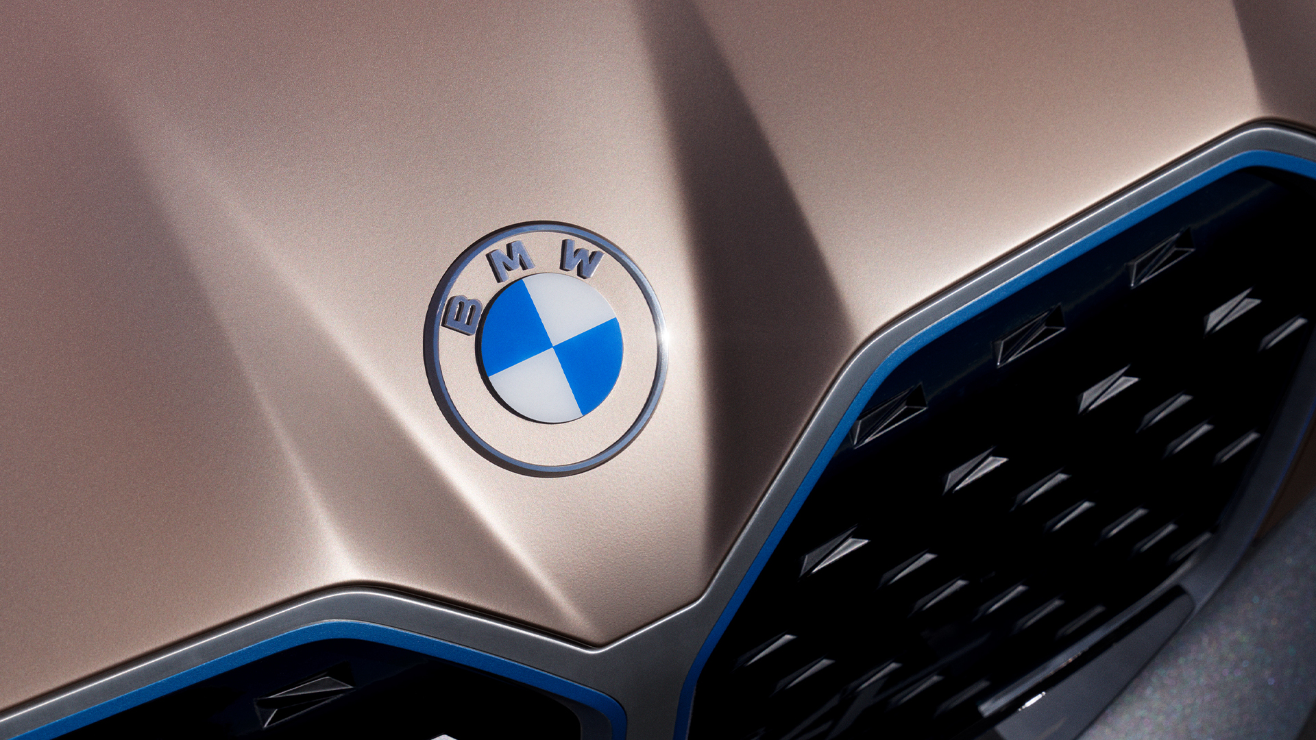

Update 3/5/20 1:50 pm: The Drive has learned that BMW will not be applying its newly-released logo on its cars, per a press release claiming that “it won’t be used on the vehicles or in the exterior and interior labeling of dealerships.” Our original story has been edited to reflect this update.
BMW’s new branding has officially settled the debate: the world is flat. The design world, that is. A brand new look for the BMW Roundel and its accompanying M-division badging has debuted to the world, sparking the flame that is the automaker’s new identity.
The German marque knows that the paradigm of its buyers is shifting. Customers are getting younger and are encroaching into the territory of those who are native to the digital age. In short, the brand needs to modernize and that’s exactly what it’s done, but oddly enough, its new and high-tech logo will not be applied to vehicles or dealerships. Instead, it will be used on “all communications, on- and offline, and for international trade fairs and events.”
“BMW is becoming a relationship brand. The old black ring was replaced, letting the new logo radiate more openness and clarity., said Jens Thiemer, senior vice president of BMW Customer Brand. He later added: “The new logo and brand design symbolizes the importance and relevance of the brand for mobility and the joy of driving in the future.”
In addition to BMW updating its famous Roundel, it has also renewed the styling of the visuals which represents its M-performance and i-brand divisions.


Each logo is now completely flat. Its design principles dictate a modern two-dimensional approach, completely stripping the motif of any three-dimensional shadows or shading.
A manufacturer changing its logo and re-branding the vision behind its brand is a big deal. But don’t think this is the first time that the Germans have adapted its Roundel to changing times. In fact, the new logo for 2020 marks the brand’s sixth revision of its famous blue-and-white circle marking.
More importantly, it signals the inevitable end to the automaker’s outgoing logo which stuck around for 23 years.

Despite the drastic change, the branding retains its notoriety—the colors of Bavaria will still be shown proudly in every car. It’s not BMW giving up on its past, but rather the automaker embracing its future; one with a plethora of connected and electrified cars.
Got a tip? Send us a note: tips@thedrive.com