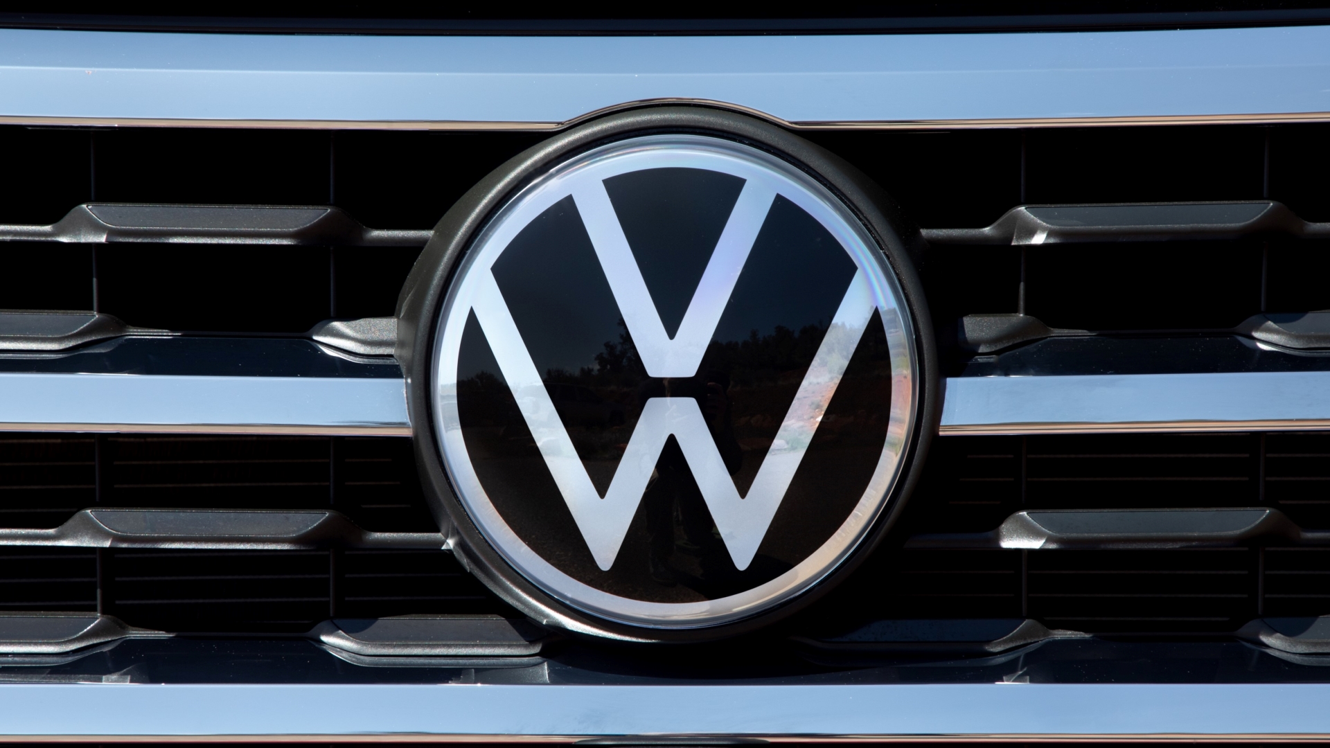

In case you haven’t heard, Volkswagen is rebranding with a new, flatter logo that apparently lends itself better to the company’s imminent batch of new electric cars, is simpler to display on a wider variety of screens, and lets the brand visually distance itself from the dark Dieselgate days.
Like the reworked R logo, VW’s redesigned corporate mark is thinner and lighter looking. It ditches the old logo’s skeuomorphic drop shadows and should be way easier to draw from memory if you’re ever challenged to draw it from memory. It’s a relatively subtle rework which is probably why we like it.

And unlike BMW’s more controversially redesigned badge, this will actually be used on the cars themselves, already having made its U.S. debut on the 2020 Atlas Cross Sport. Here it is on the nose and steering wheel of the 2021 Atlas.


For comparison’s sake, here’s what the old logo looked like in the same places on the outgoing Golf. Exciting stuff, we know.


In addition to delivering an ever-so-slightly lighter look, VW design boss Klaus Bischoff said, “This rebrand also brings Volkswagen into the digital era, transforming our classic logo into a trademark that is easily displayed digitally on devices and applications.” It was apparently designed keeping in mind screens as small as a smartwatch.
On top of being more in line with the electric and digital age, VW’s new, simpler logo has already been reconfigured to fit with the coronavirus-induced era of social distancing.

The new Volkswagen logo is rolling out in the U.S. now and will apparently reach 10,000 dealerships across 154 countries by mid-2020.
Got a tip? Send us a note: tips@thedrive.com