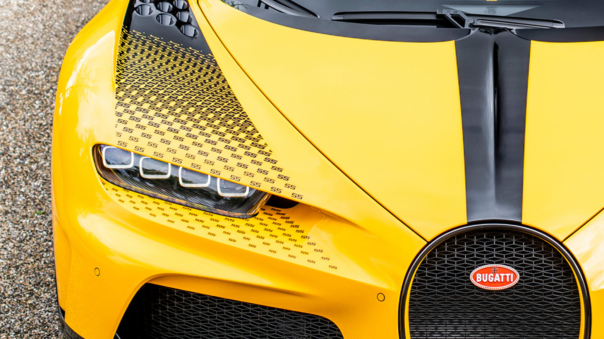
It feels a little silly to call out a tiny decorative element when talking about a monster hypercar like a modern Bugatti. But sometimes small flourishes are fun, and I have to say the stylized number 55s on the fenders and door cards of this bee-liveried Bugatti Sur Mesure are very cool.
Sur Mesure is what the French company calls its super-special, one-off build and customization department. Bugatti was proud enough of this particular one to grab a nice photo gallery before sending the car off to (probably) be parked indefinitely among some rich guy’s other trophies.
Bugatti has a whole hype reel and press release explaining the inspiration and tie-in of this 55 1 of 1 Chiron Super Sport black and yellow design. It is not, in fact, a Pittsburgh Steelers tribute. It’s a nod to a car driven by Jean Bugatti in the 1930s, and apparently, Ettore Bugatti himself was particularly fond of this pollinator color combo.

BUGATTI Sur Mesure: The CHIRON Super Sport ‘55 1 OF 1’
I just want to call out the creativity of one very specific detail: How designers worked the number 55 into the color scheme.
Graphics, in general, can do a lot to elevate a car’s looks, if they accentuate or complement the vehicle’s lines and vibe. That’s a tough thing to achieve while incorporating a numerical character—you’re aesthetically anchored to two factors (the car’s body and the number), plus you have to pick the right font.


Bugatti designers made a halftone-style fade with the number 55 on the fenders here, beginning just fore of the vent holes near the windshield and kind of squiggling from a solid black space to a repeating 55 pattern. It’s almost like something you might see on a handbag. It looks simultaneously classy and racy, which fits a seven-figure land-bound cigarette boat like the Chiron perfectly. Plus, “55” also looks like “SS,” and this is, well, a Super Sport Bugatti.

In addition to the front fenders, Bugatti’s interior designers repeated the solid-color-fading-to-55s in what looks like embroidery. That feels like a particularly brave choice. If you’d described this idea to me: “We’ll embroider a bunch of 55s but then fade it into a mesh-like solid space,” I would have thought it’d look like a child’s sewing project with a stain on it. But the execution here is amazing.
They managed to pull off a fade look using only three layers. Artistically speaking, that’s impressive. Inspired to take a closer peek at the Chiron in general after seeing this, I realized Bugatti’s done a stylized character fade in this style before.
Here’s a similar execution of a fade that spills over the fenders, using the Bugatti EB logo instead of a number. Doesn’t look quite as cool as the number I don’t think, because you lose the squiggle that the 55 character made room for. But this is still neat.

Yes, it’s cool that these cars can go 300 miles per hour, but it’s especially fun to examine and analyze decorative details on a vehicle built to this level of artistry.
Got a tip? Email us at tips@thedrive.com