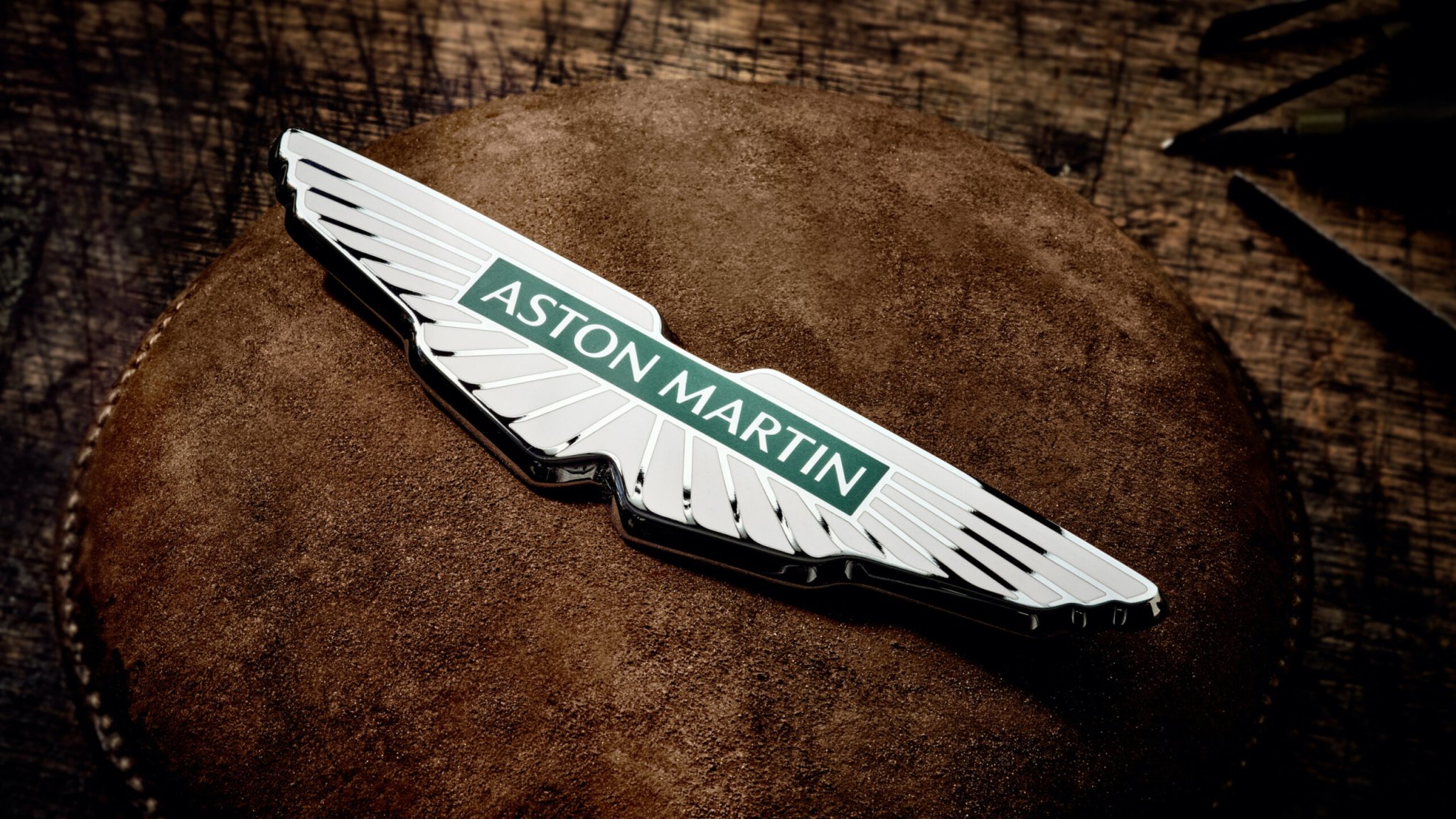

Aston Martin unveiled its new logo Wednesday as part of a push to reposition the brand and appeal to a wider audience, and well, it looks a whole lot like the last one. Phew.
For decades, Aston Martin’s logo has been one of the most beautiful ones in the auto business—and outside the auto business, too. Astons have worn some form of a winged logo on the front since 1927, with the scarab-beetle-inspired version of the logo we know today first appearing in 1932. Those wings have been subtly refined several times since then in ways only design geeks will likely notice, all while the company gained an international following.

To create the updated logo, Aston hired British art director and graphic designer Peter Saville, a designer who rose to prominence doing album covers for bands like Joy Division and New Order at Factory Records.
That’s right: The same guy responsible for the ultra-ubiquitous wave design on Unknown Pleasures did the new Aston wings.
“The Aston Martin wings update is a classic example of the necessary evolution of logotypes of provenance,” Saville said in a statement. “Subtle but necessary enhancements not only keep forms fresh, but allow for new technologies, situations and applications to be accommodated in the future. The process was one of clarifying and emphasizing the key feature of the Aston Martin marque.”


This latest iteration of Aston’s wings loses a silver half-circle around the Aston Martin wordmark and rounds off some of the edges. It’s fresh and friendly, but still classy and recognizable as the Aston logo. Not much has changed! Again: phew.
Aston unveiled its new wings along with a new marketing push centered on the slogan “Intensity. Driven.”
One of the short films they released accompanying the new brand push even shows off the process of making the winged logo that will go on new Aston cars. Each badge is hand-crafted by Vaughtons, a 203-year-old silversmith firm in Birmingham also known for making the medals for the 1908 Olympics as well as the Football Association Cup.

Aston’s new logo officially debuts on its F1 cars this weekend at the French Grand Prix. Aston’s F1 cars will also have Aston’s original button logo on the nose of its cars this weekend to celebrate the 100th anniversary of its first Grand Prix race entry. We’ll start to see it on new cars starting with the next-generation Vantage, DB11 and DBS, per Autocar.
Aston’s easily recognizable wings come as a huge relief given that the trend of simplifying automaker logos has been mixed. The ones that stay closest to the original, like these new Aston wings and Volkswagen’s monochrome update of its iconic circular VW, are fine. We’ve got a lot of duds out there, though. Volvo’s recently reworked logo isn’t bad, but feels hollow with its wordmark floating in a circle. BMW ditching the white band around its flattened roundel feels more complicated than leaving it there as one piece, negating the whole point of the minimalism trend. Cadillac curiously ditched color from its crest entirely, and don’t get me started on GM’s “rejected Y2K WordArt” vibe, either. It’s a forgettable logo, and hard to read, too.
So, there are plenty of reasons to worry whenever anyone announces a new logo. It always feels a little pointless on the consumer end—as in, any problems with your cars weren’t with the logo. But if it somehow inspires the wonks at Aston Martin to keep making beautiful cars, we’re for it.

Got tips? Email the author: stef@thedrive.com