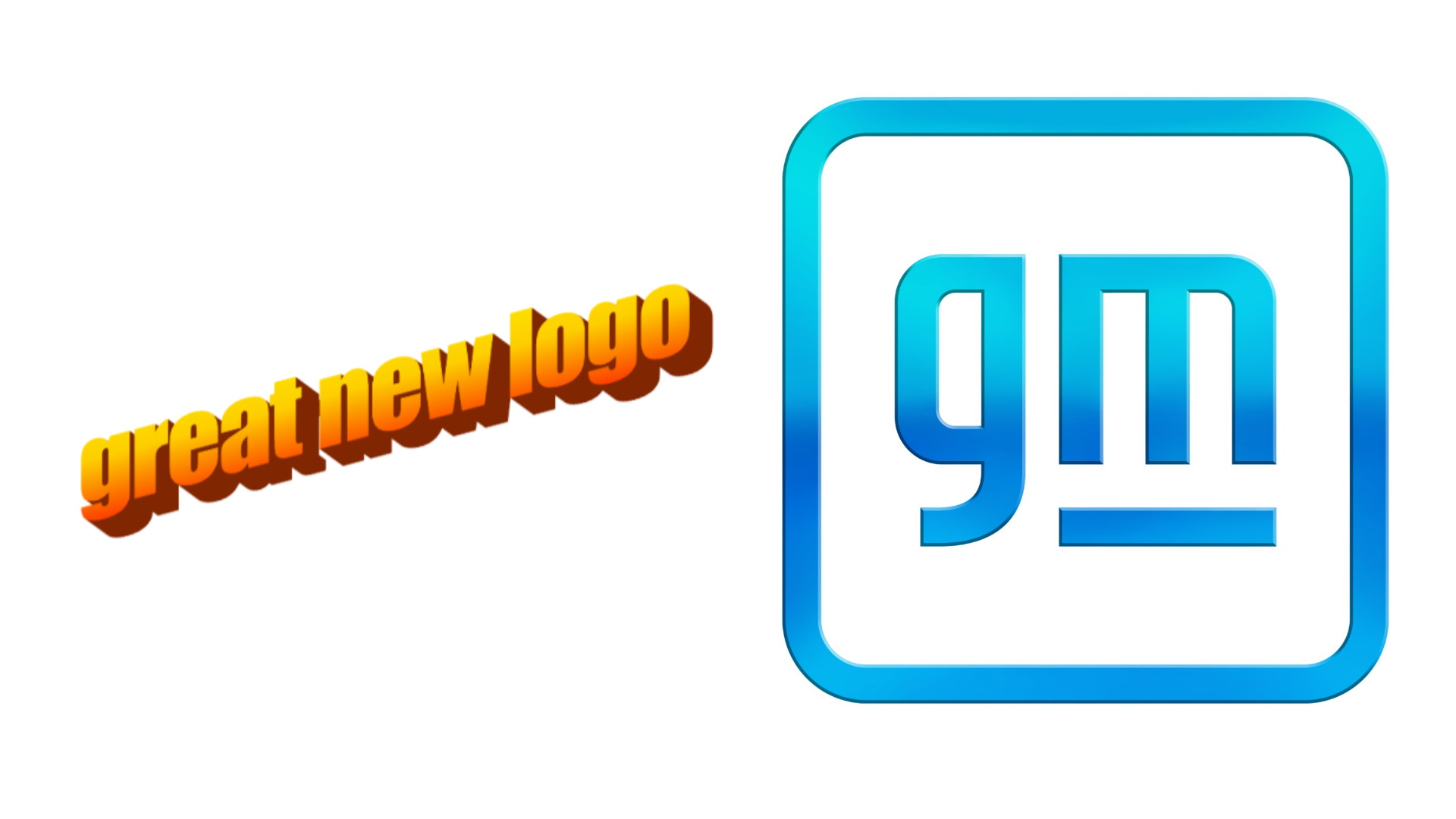

General Motors plans to offer up more than two dozen brand new electric vehicles by 2025 with official unveilings beginning this year. It’s appropriate, then, that with a change in direction as serious as this one, the automotive giant gets a new logo. Yes, it still has the letters “G” and “M,” but its basic design has changed almost entirely.
Gone are the squared-off lines and uppercase font, replaced with lowercase characters and rounded corners. In one version of the logo, a blue gradient—reminiscent of Microsoft Powerpoint’s “Word Art” from years gone by—fills the entire block of shapes and characters. The regular monochromatic versions of the logo might not be that bad-looking, but the gradient looks a little… lost. To say it was designed by a child might be a stretch, but a teenager in the Nineties or early Aughts? That’s pretty fair.


This new logo is part of a campaign known as “Everybody In,” which basically lays out an inclusive, electric future for the company. What GM is saying is that it has all the technology and manufacturing capability to make a better future, so it’s turning a corner and doing that. As far as how serious it is about such a future, the company plans to invest $27 billion in EV and automated vehicle products through 2025, which is a tremendous amount of money for an automaker. It also says that within that time, 30 new EVs will be launched, which is no small number.
Speaking more about the logo, the brand says the negative space within the “m” is supposed to represent the prongs of an electrical plug, which it sort of does. As far as changing the case, it says that’s been done to make the logo feel less official and more inclusive. That’s a little more abstract, but at least an effort was made to explain the company’s rationale. The company also says that the gradient isn’t new, it was carried over from the brand’s previous logo, although it somehow looks worse here. Along with the new logo, GM also plans to launch a new website at GM.com on Jan. 11, so if you’re very interested in this new schtick, keep an eye on that.
Got a tip? Send us a note: tips@thedrive.com