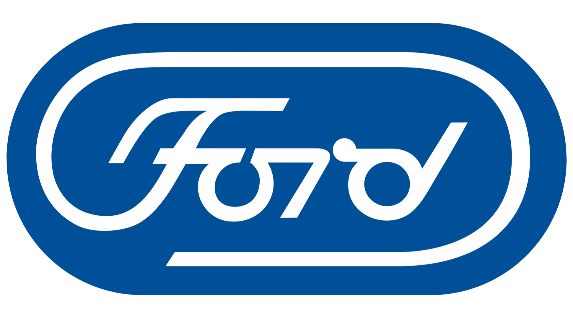

Ford’s script wordmark logo is instantly recognizable even on its earliest models, but the famous blue oval almost got a sleek update in 1966 at the hands of one of history’s most legendary graphic designers.
Paul Rand’s design work is all but unavoidable, especially in logo form. He’s the man responsible for ABC’s round network logo as well as the Cummins C and even Enron’s infamous “crooked E.” His long-running UPS logo featuring an updated company shield with a little box on top deserves a comeback, but I digress. He did numerous magazine and ad designs as well that helped set the bright, high-contrast, high-impact mood for the mid-century era and beyond.
Rand presented a proposal for an updated Ford logo in March 1966, which you can read in its entirety here on a site dedicated to Rand’s work. It’s immediately recognizable as a Ford logo, but it’s been pared-down for the sleek, modern sixties.

The proposal for Rand’s new logo is particularly interesting, as it dives into the fancy-schmancy design trends that were at work when Ford’s first wordmark was created:
“Graphic identification was viewed more as artistic embellishment than functional necessity. Business logotypes had a kind of ‘raised pinky’ elegance inspired by a variety of 17th century Copperplate scripts, weighted and vulgarized to suit the needs of commerce. Fanciful typefaces and ornamental extravagances of every description further typified the mood of the time. One was, however, affected more by the ingenuous charm of these designs than by their genuine look. And ‘charming graphics’ were hardly a match for the daring mechanical imagination of the day.
The graphics of 1900 were, in a sense, a product of the time: life was more elaborate, more ceremonious. There were fancy speeches, fancy customs, fancy hats and fancy parlors — all, indeed, compatible with fancy nameplates and escutcheons.”
Even Ford’s mass-produced everyman’s car couldn’t escape the early 1900s’ trend of fancy ornamentation.

The sixties were the exact opposite. Simpler modernist forms were in, and Rand believed that Ford’s blue oval wordmark was “incongruous in point of time with its environment.” Yet the Blue Oval’s blue oval was well-known. Rand believed the best update would “make a significant change in style while retaining meaningful identifying characteristics of the old house mark.”
The text underwent the most drastic change. Rand was determined to drag it into the present day, emphasizing that simpler forms are associated with function, speed and efficiency and would better represent what Ford made. Rand’s proposal explains:
“The house mark of Ford Motor Company should reflect the authority and confidence the company and its products merit. It should look functional and it should be functional. It should not be characterized by melodramatic swirls and theatrical flourishes, but by a frank and unpretentious, almost disarming simplicity, achieved by means of geometry and ordered relationships, with simple lines and forms that are measurable and manageable, and which reflect the precision of the machines they help to identify. It should suggest strength, speed, efficiency and utility. It should be clear and concise, with a kind of beauty and precision which flow not from the quill but from the compass and ruling pen. It will then emerge an integral part of the machine design, rather than decorative decalcomania.”

In his update, he flattened the top and the bottom of the oval as he didn’t feel as if a standard oval was distinctive enough from every other oval shape out there. It’s an interesting update because even with all these changes, you can still recognize it from far away as Ford’s blue oval. The frame around the oval was integrated as an eye-catching extension of the wordmark as well.
Rand also illustrated examples of the new logo in use on dealership signage, stationery, ads and buildings. Ultimately, it wasn’t meant to be.
As cool as it is, I’m glad Ford didn’t run with it. Whereas Rand’s still-used logo for IBM still looks fresh and modern, this 1966 Ford design looks a bit dated now, especially in comparison to the start ways Volkswagen and BMW have recently simplified their logos even further. We may have even ended up with something drastically different as a Ford logo today after another redesign.
You can view the other illustrated examples in Rand’s logo presentation here.

[H/T Midwest Modern via Lux Ferre!]
Got a tip? Send us a note: tips@thedrive.com