
Earlier this week, I explained how Mazda finally admitted its infotainment system is the worst. The outpour from readers in our comment section, as well as Reddit, was swift. Some owners said they got used to the scroll-wheel interface after living with the system, while others were less willing to deal with it, claiming they immediately returned rental cars upon realizing the system wasn’t touchscreen.
Consider yourself heard on every level. I’m currently driving a 2026 CX-90 Plug-in Hybrid. I was recently in the CX-70 and CX-50 Hybrid. Last summer, I road-tripped in the CX-90 with the turbo-six. In some form, I’ve spent countless hours with the many iterations of Mazda’s infotainment system as screens grew larger, resolution sharpened, and Apple CarPlay was adopted. As a result, here’s how I think Mazda could’ve fixed its system.
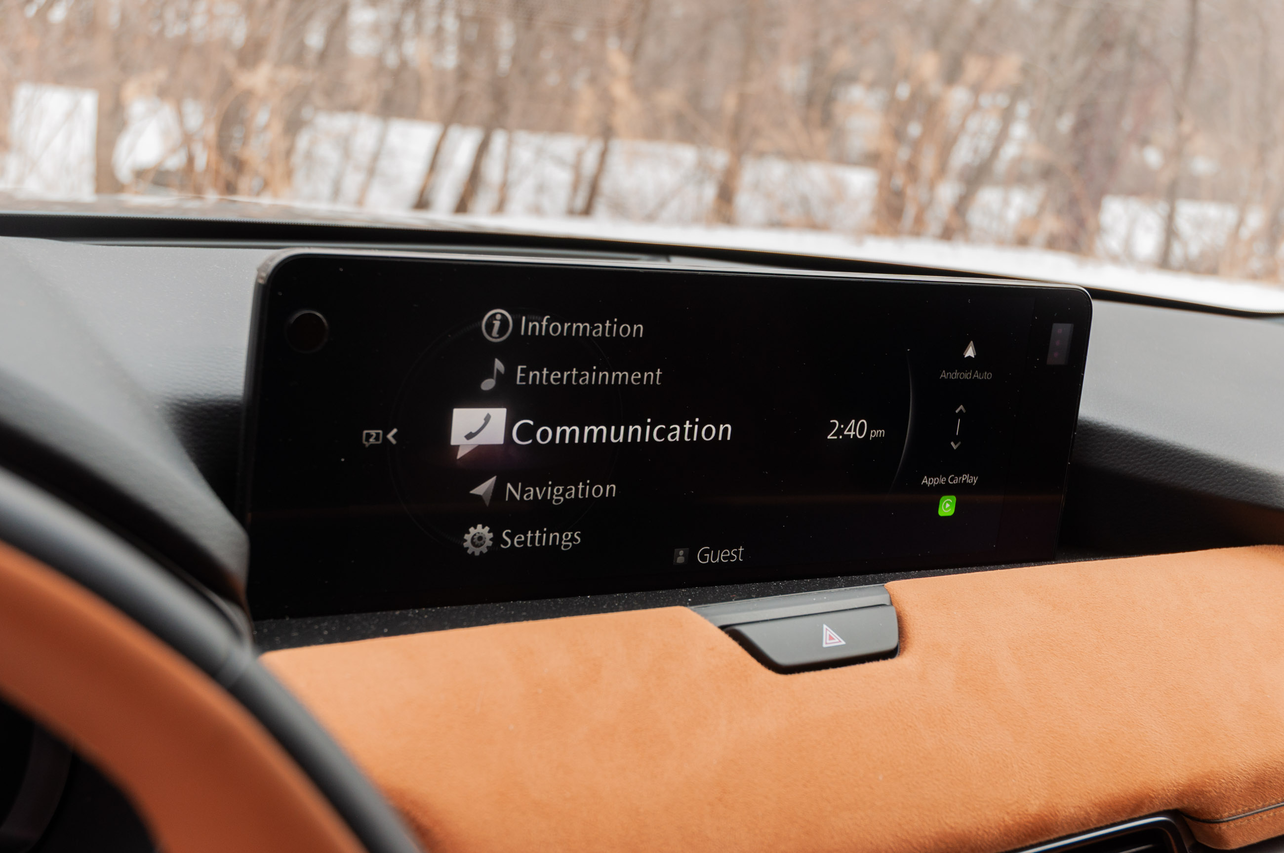
First off, it didn’t have to ditch the scroll wheel, quick function buttons, or the volume knob. All of this could have been kept. As discussed, Mazdas with the larger 12.3-inch screens have touchscreens, but the touch functionality is disabled when the car isn’t in Park and outside the CarPlay interface. Users can dig into the menu and enable touch capability to work while the car’s in motion, but it’s still limited to the CarPlay.

The issue is that the screens are mounted on the dashboard like tablets, and they are too far away for most users, including me, to reach comfortably. Especially the entirety of the screen. The screen itself isn’t mounted for regular touch use because the system wasn’t designed for it.
Mazda’s native infotainment system interface isn’t touch-based, can’t be made touch-based, and really does mimic older versions of BMW iDrive and Audi’s MMI systems.

Ditching all this for a 15.6-inch touchscreen and no volume knob in the new 2026 CX-5 is the exact opposite and it surely saves Mazda money. The climate control buttons in the current cars are lovely, with toggles and buttons that provide a satisfying click.
Mazda could’ve solved its infotainment system issues by simply moving the screens closer to the front-seat occupants, enabling touch functionality throughout the system, and redesigning the native interface to be more modern. Hyundai’s tile-based interface, which gives way to iPad-like icons, is a good place to start. Keep the scroll wheel and the volume knob, even the hot keys. Users can use them for quick changes or for scrubbing audio in a podcast or song.
A happy medium would’ve seen today’s hardware shifted and given a modern interface. I hear you, Internet. The issue isn’t the hardware; it’s the software, screen positioning, and Mazda’s all-or-nothing approach to all this.
Even Cadillac offers an iPad-like interface augmented by a screen wheel, volume knob, and quick keys in its EVs and the latest Escalade. It doesn’t have to be this complicated.
Got a tip about tech? Send us a line at tips@thedrive