Screens in cars: It’s a sore subject for many, and everyone seems to have some opinion on it, whether they actually like cars or not. I’ve always believed that while we could never go back to the way things were—modern vehicles are just too complicated to have buttons for every single setting—there’s a line as to what’s reasonable, and automakers have long since crossed it. But after spending a week with a Lucid Air Touring, I think I’ve settled on a particular use case for screens that just makes sense, that I might actually prefer to the analog equivalent.
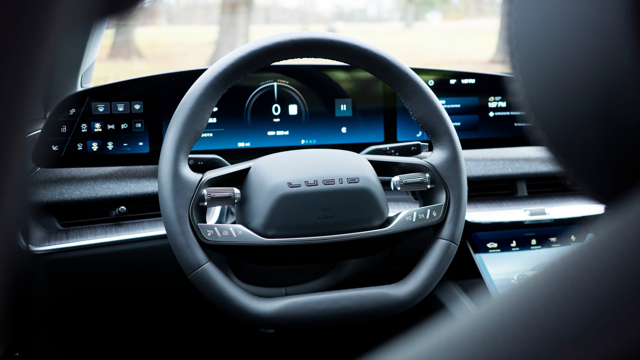
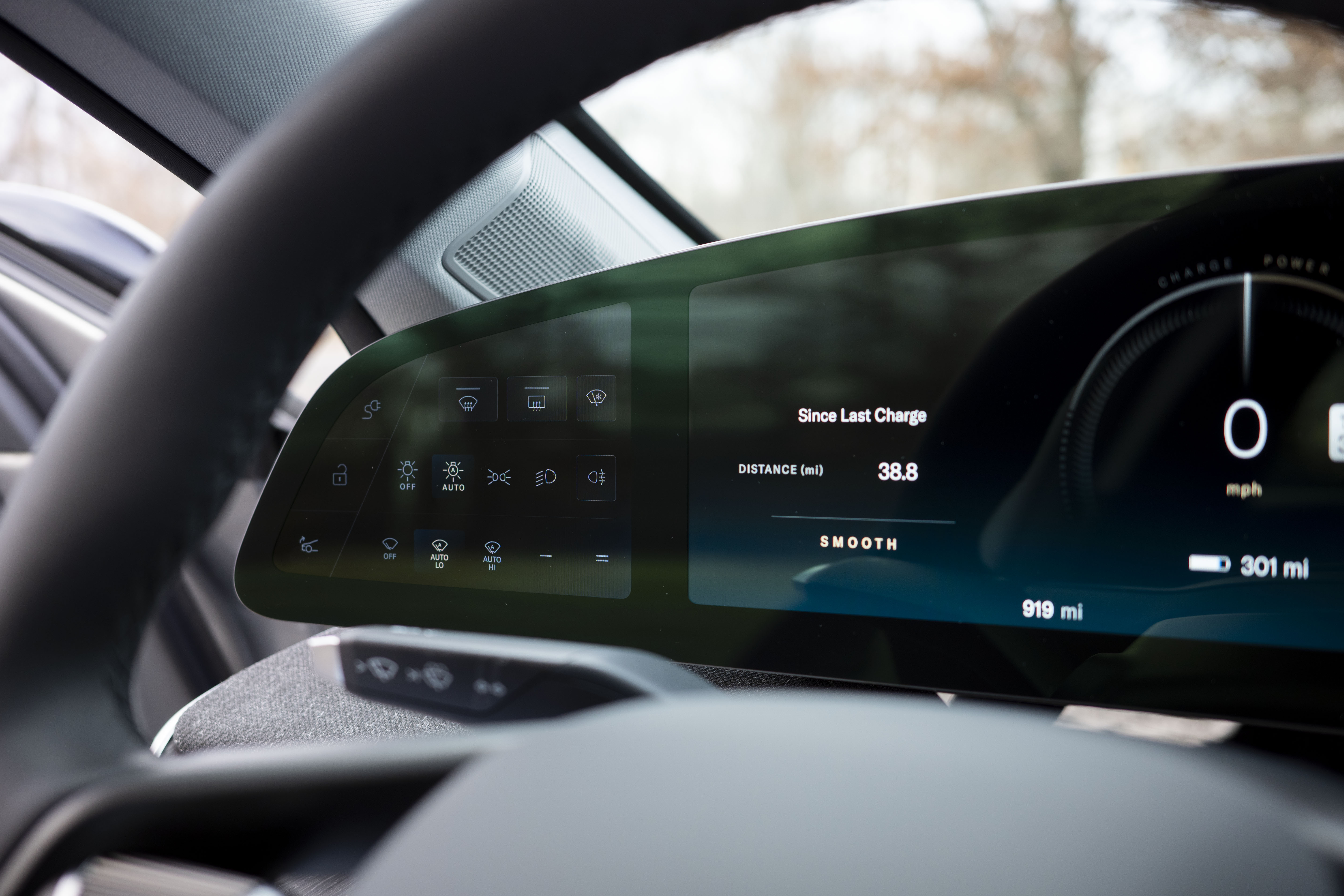
Lucid calls theirs the “Left Cockpit Panel,” which isn’t a terrible name for it, because it emphasizes how the placement of this screen is really important to its effectiveness. Basically, it encompasses all features ancillary to driving that are still nevertheless important—stuff like windshield wiper behavior, lights, and defogging, as well as opening and closing the charge door and frunk, because this is an EV. And the way Lucid has laid it out, as you can see in my photo below, is really straightforward.
We all know what these icons mean and what pressing them does, and there’s no second or third page of menus to scroll through. It’s all right there. Those glyphs will probably burn well into that display after years of use, but since it never shows anything different, that doesn’t matter.
Because the Air uses its right stalk as a “gear” selector, it can’t stash controls for both the wipers and lighting on either side. In a case like this, many automakers will stow away some of those controls in a panel of buttons, maybe a dial, to the left of the steering wheel, but below the center line of the dash. My Corolla, for example, has a few functions down there, like the auto high-beam toggle, and another for the heater to melt ice under the wipers. Car designers basically treat this space like the junk drawer of automotive features, and it often feels like there’s no rhyme or reason to what ends up down there.
Also, it’s down there—as in, away from line of sight. In my car, I have to move my head to see the entire strip of buttons. That’s not very useful. Sure, screens don’t offer tactile feedback, but with Lucid’s Left Cockpit Panel, at least I can easily see all of these controls from where I’m sitting. And because they’re connected to the kind of things that you might only mess with up to three times on a journey, the fact that they require briefly averting your gaze isn’t a huge deal.
Now, would this panel be better if every toggle it contained were an actual button and not on a screen? Perhaps, but again, given how infrequently you have to interact with it, I don’t think that would make a huge difference. Besides, I can’t remember the last new car I drove that used the space directly left of the instrument cluster for physical buttons.
Some automakers, aside from Lucid, have experimented with smaller displays focused entirely on a specific function. Kia, for example, has started putting more granular climate system controls in a tiny panel to the right of the instrument cluster, before the main infotainment screen.
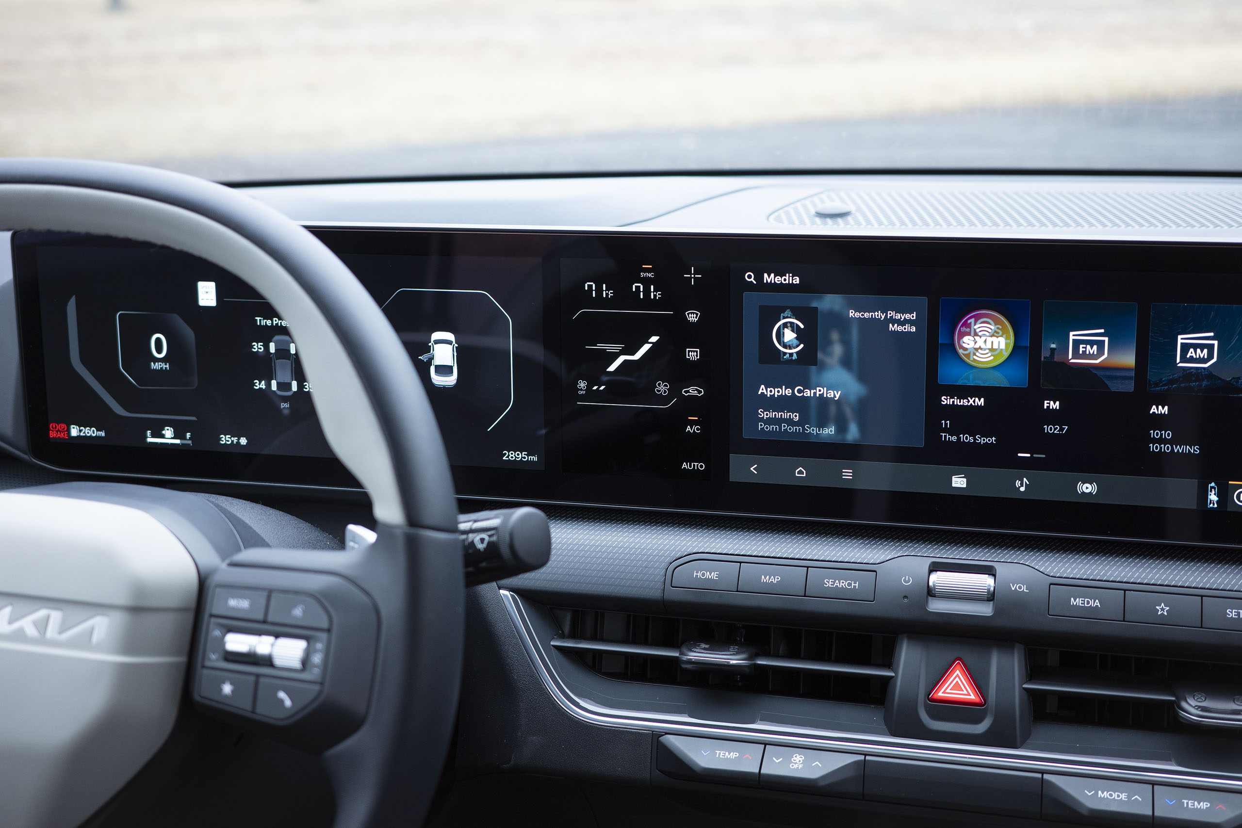
I kind of like the look of it, but it’s not a perfect solution. Because that panel contains both software buttons and information that can only be read, it feels harder to quickly interact with. It also tends to be partially obscured by the wheel from the driver’s perspective, and may as well be a football field away from the passenger. And passengers love to fiddle with climate controls.
By contrast, Lucid’s Left Cockpit Panel succeeds both in concept and execution. That’s often unused space in most cars, and the Air gives it a purpose, with features that are only of relevance to the driver and won’t be tinkered with all that often. It’s a screen I genuinely like in a modern car, and that’s a rare thing. Usually, I tolerate them at best and loathe them at worst.
Is there a screen in your car that you actually like and don’t merely put up with? Let me know at adam.ismail@thedrive.com