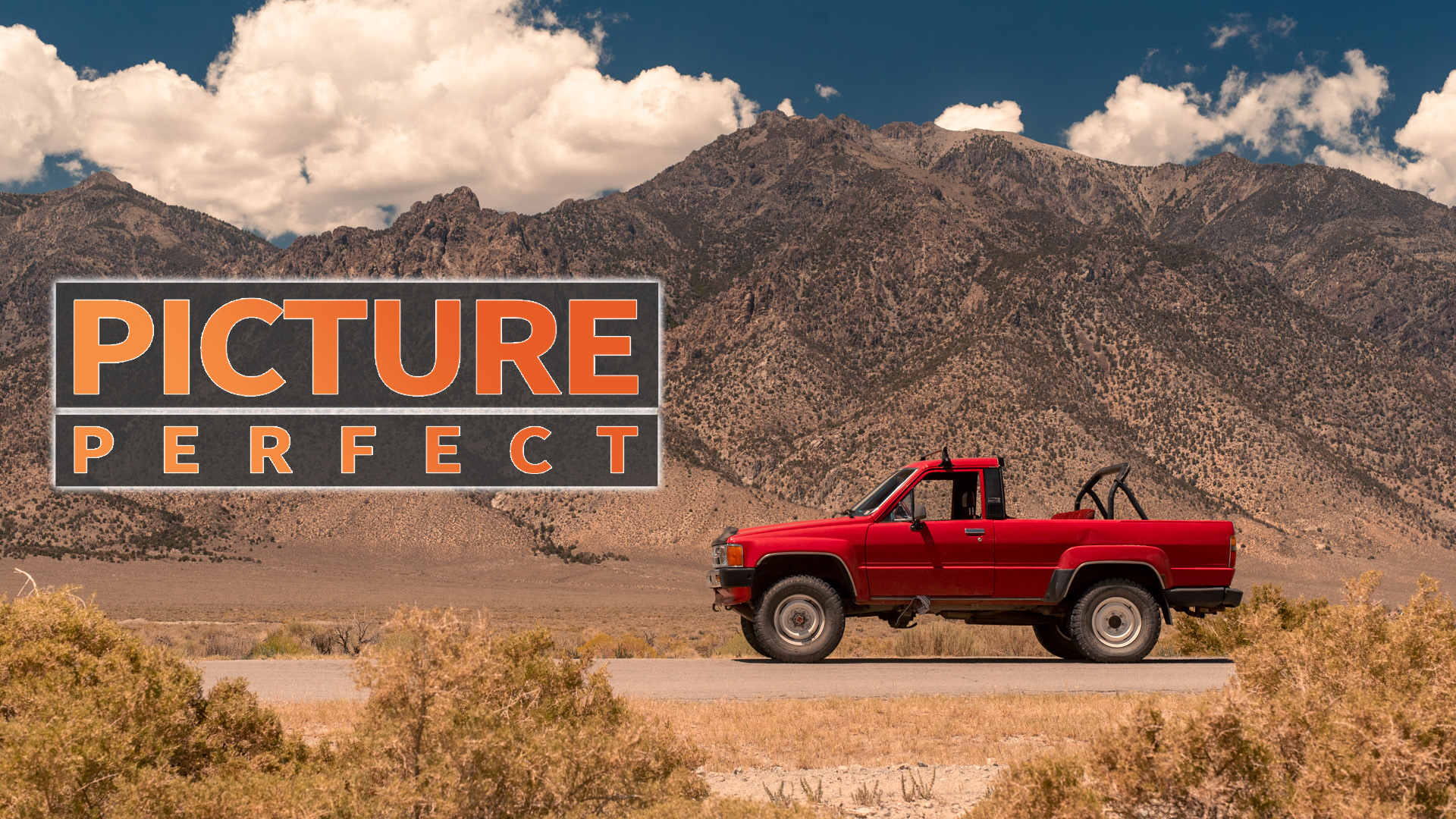
Here in the Picture Perfect series, we’ve covered how to shoot at night with and without lights, take photos of race cars in motion, and the best way to get good shots even with harsh lighting. But I’ve never gone into detail about what to do with all your photos once you’ve taken them, and getting the shot is only half the story with modern digital cameras. The digital editing process is where you can turn a great shot out-of-camera into a phenomenal picture that looks ready for the cover of a magazine. Today, I’m going to cover how I edit my car photography to carry my shots from “good” to “headline photos.”
Any modern photo editor should possess all of the tools mentioned below, and most mobile-device editing software will even have the basics, so use whatever you like! For this guide, I’ll be using Adobe Lightroom with RAW photos. Shooting in RAW will help immensely no matter what software you use, however, as the larger files contain more color and light data, and allow for much wider latitude in editing your shots.
1. Understanding the Basics
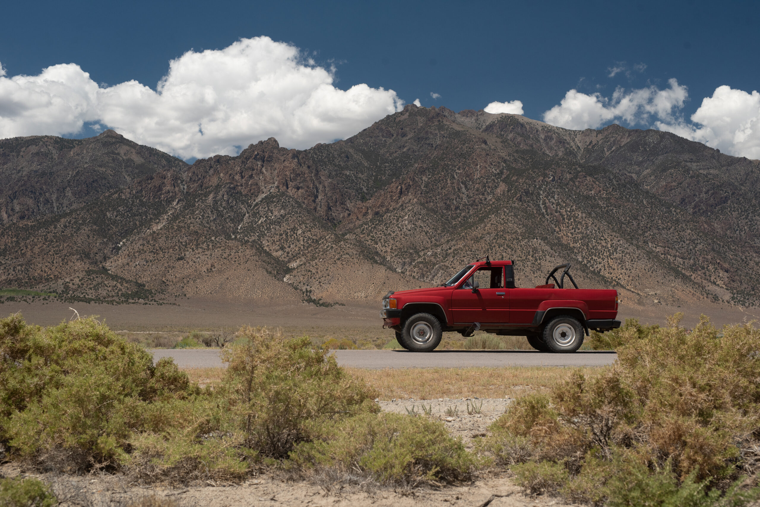
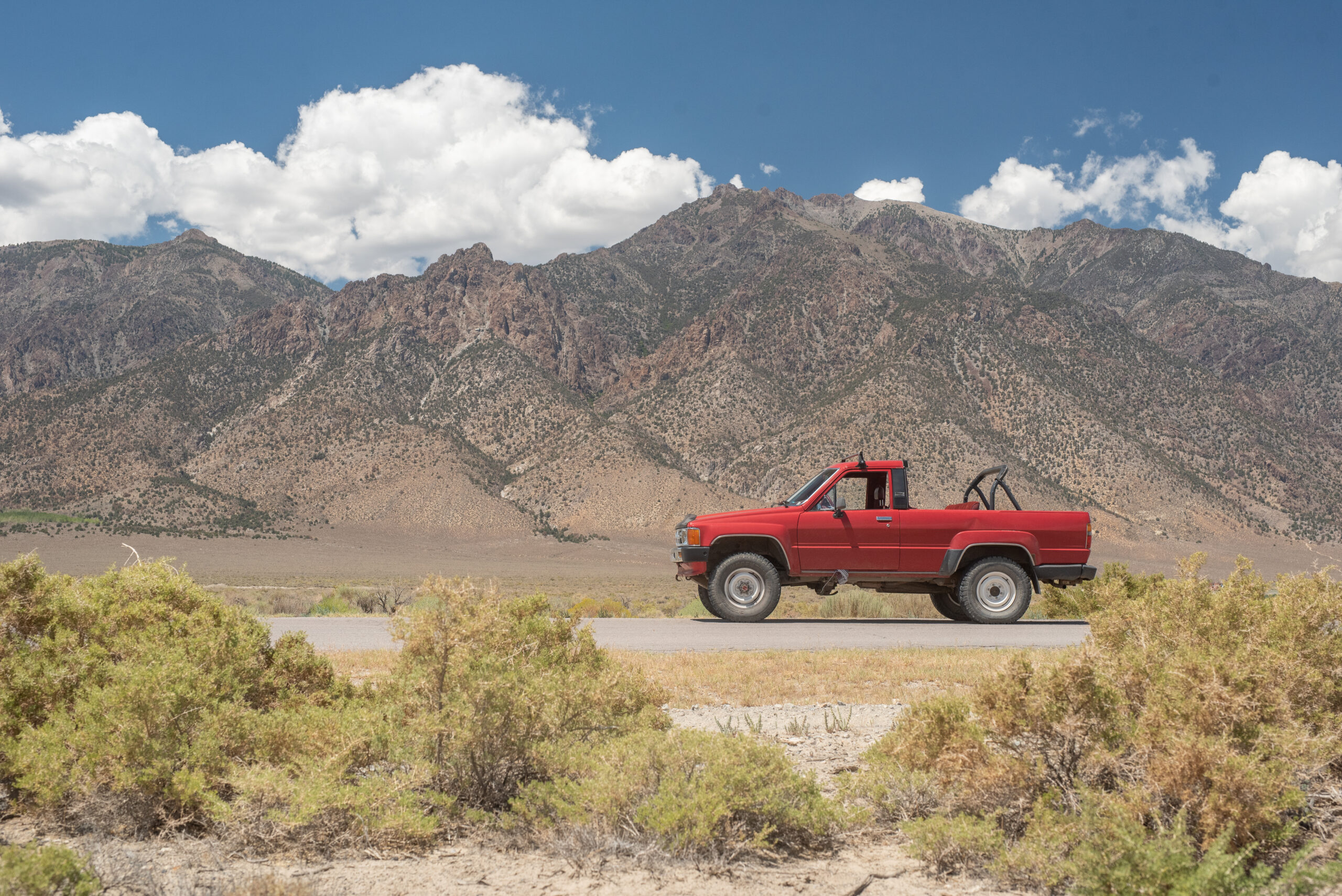
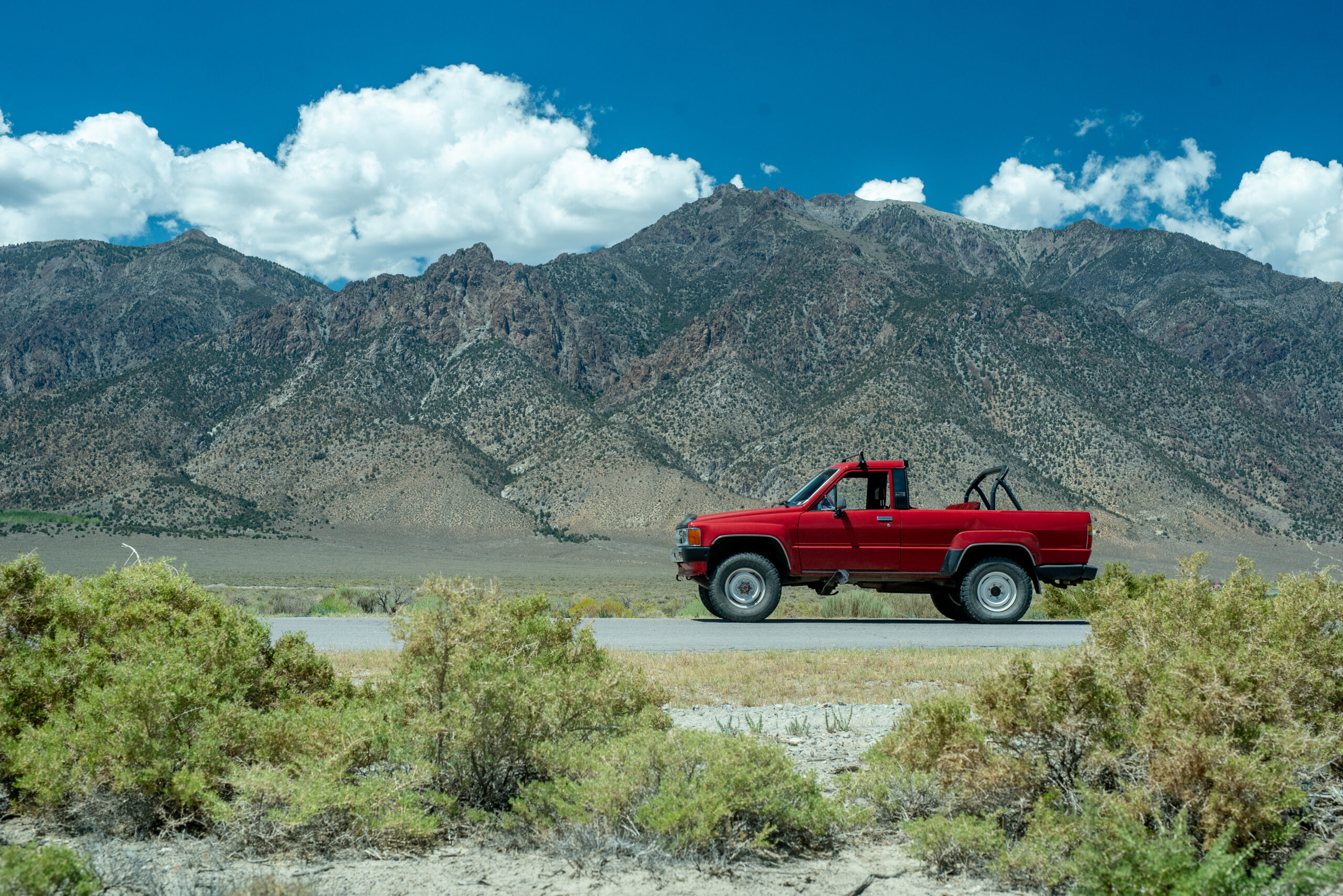
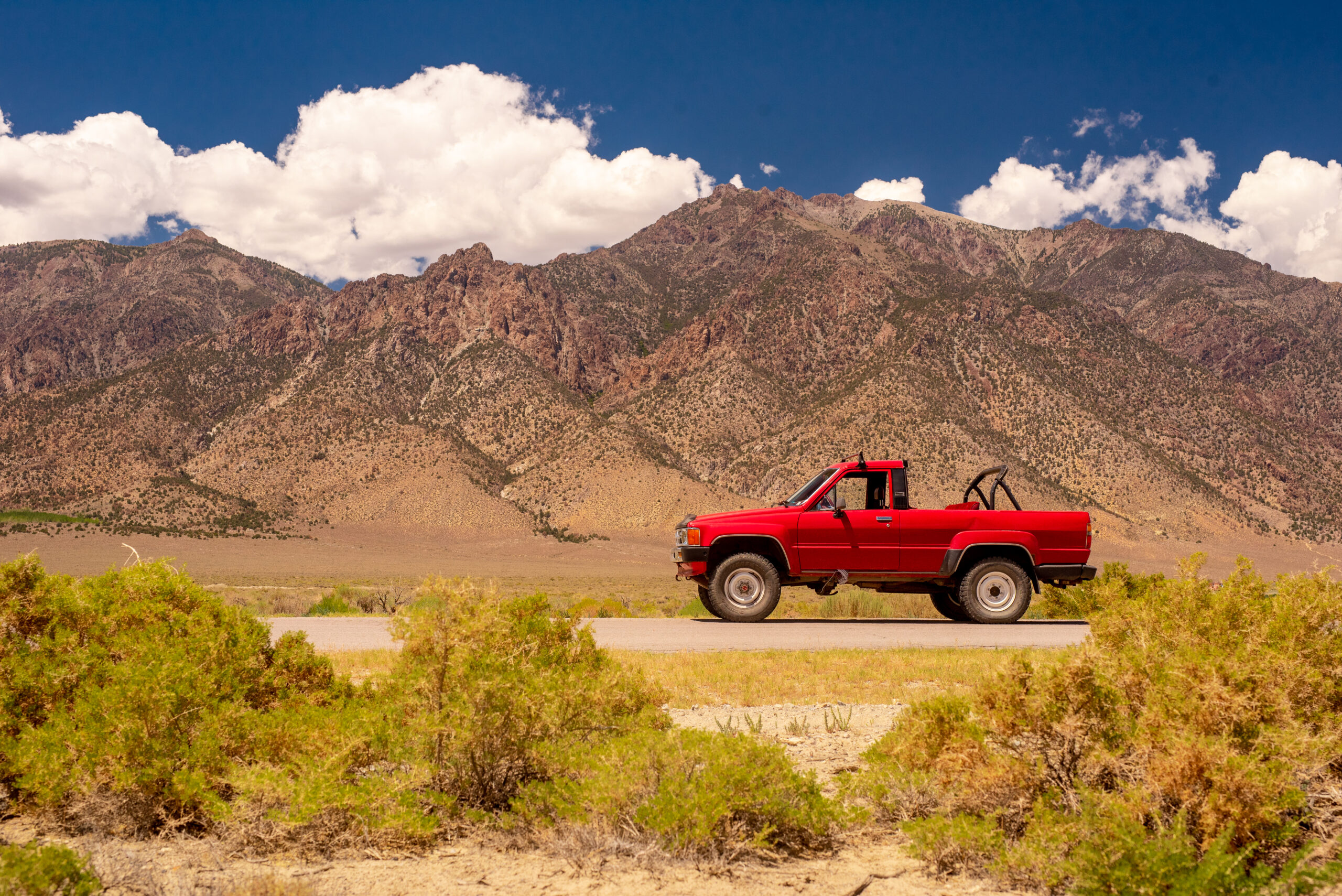
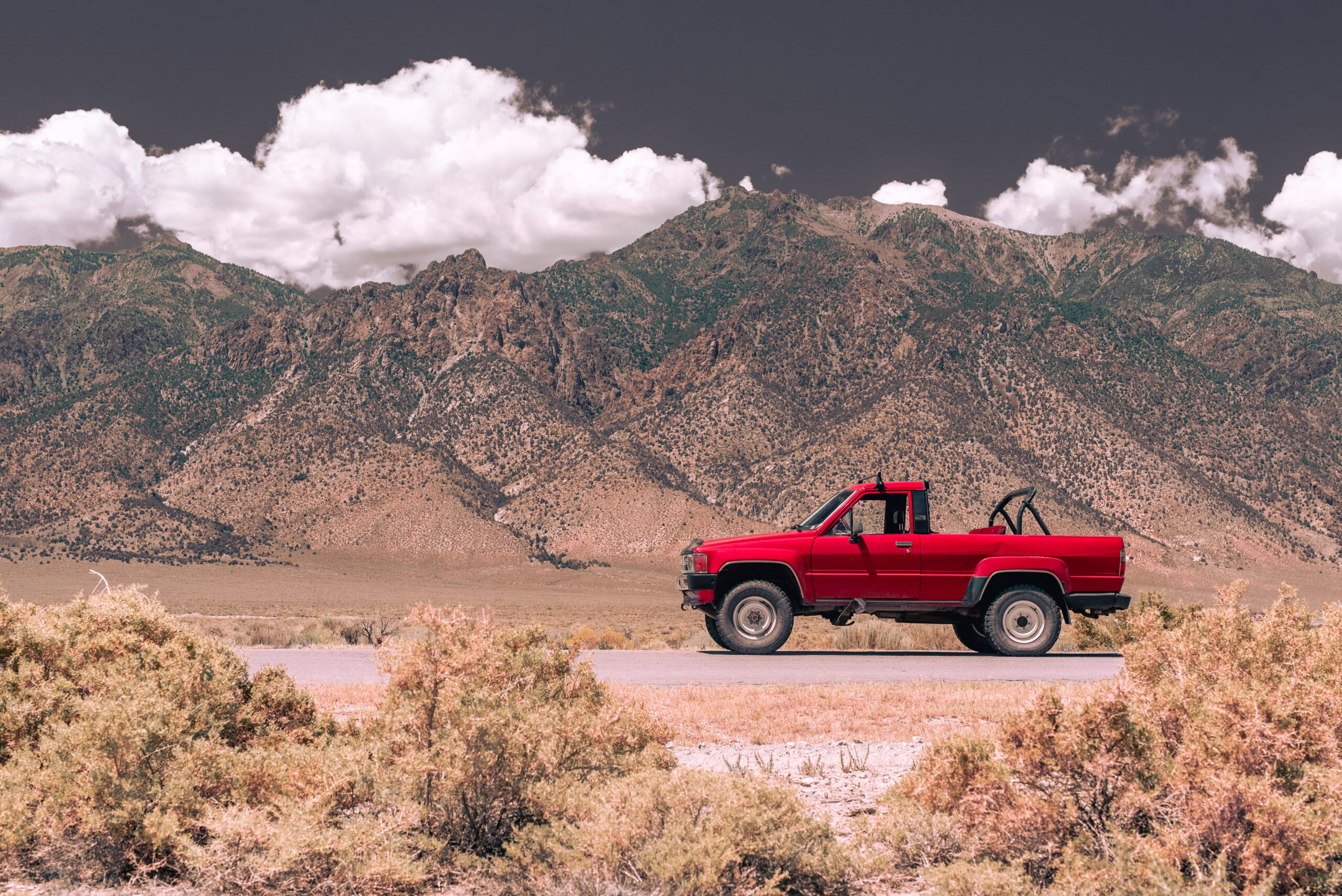
Nikon D750 + Sigma 50mm f1.4 @ f/9 for 1/800 second, ISO 400. Victoria Scott
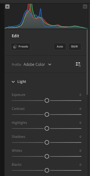
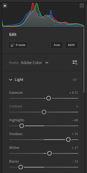
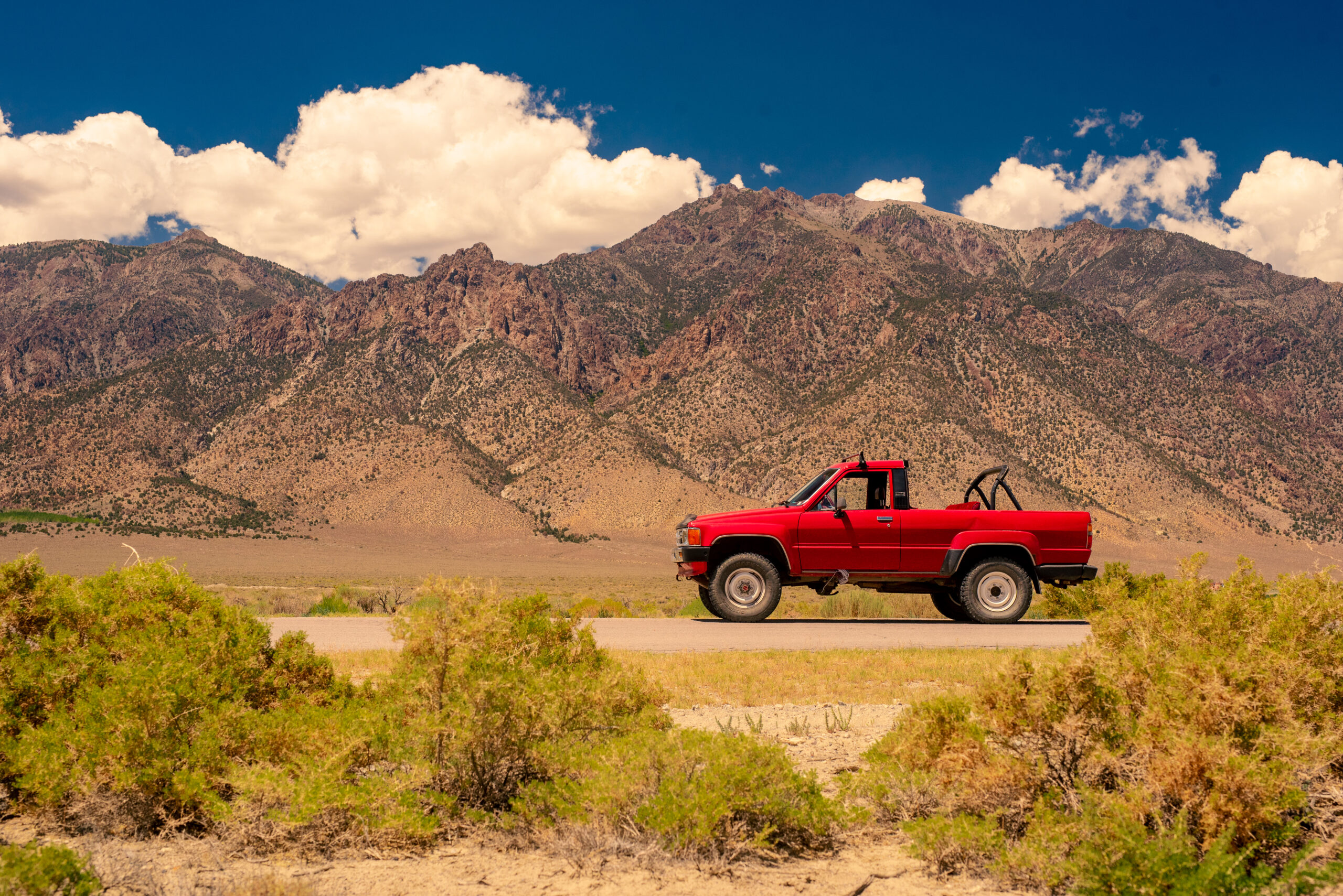
I’ll start with basic edits on a relatively simple shot, this straight-out-of-camera side-profile view of my friend’s 1987 Toyota 4Runner in front of Toiyabe Dome in rural Nevada. The “basic edits” I’m referring to here can all be done in the “Light” panel in Lightroom, where we control exposure, shadows, highlights, and other lighting-based attributes of our photograph. We can also see another crucial part of the photograph here: the histogram.
Before we begin to edit, we need to understand what a histogram is. In Lightroom, it appears at the top of the edit panel as a small graph made of red, green, and blue lines. The histogram is a representation of all the colors and light levels in an image, and it’s fairly simple to read. The X axis is brightness: the left-hand side of the histogram is the darkest part of the photo, and the right-hand side of the histogram is the lightest part of the photo, with the mid-tones represented in the middle section. The Y axis is quantity: How many pixels in the photo are each corresponding level of brightness. Each different-colored line corresponds to red, green, and blue pixels in the photo.
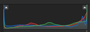
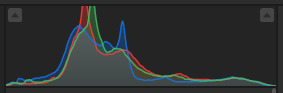
Lost detail on a histogram is represented by a graph with peaks at the very left or right of the graph, like the one shown above. Those peaks represent pixels where there is no color data, and instead, the image is pure white or black. If your histogram looks like the above one, you’ll have a bad day.
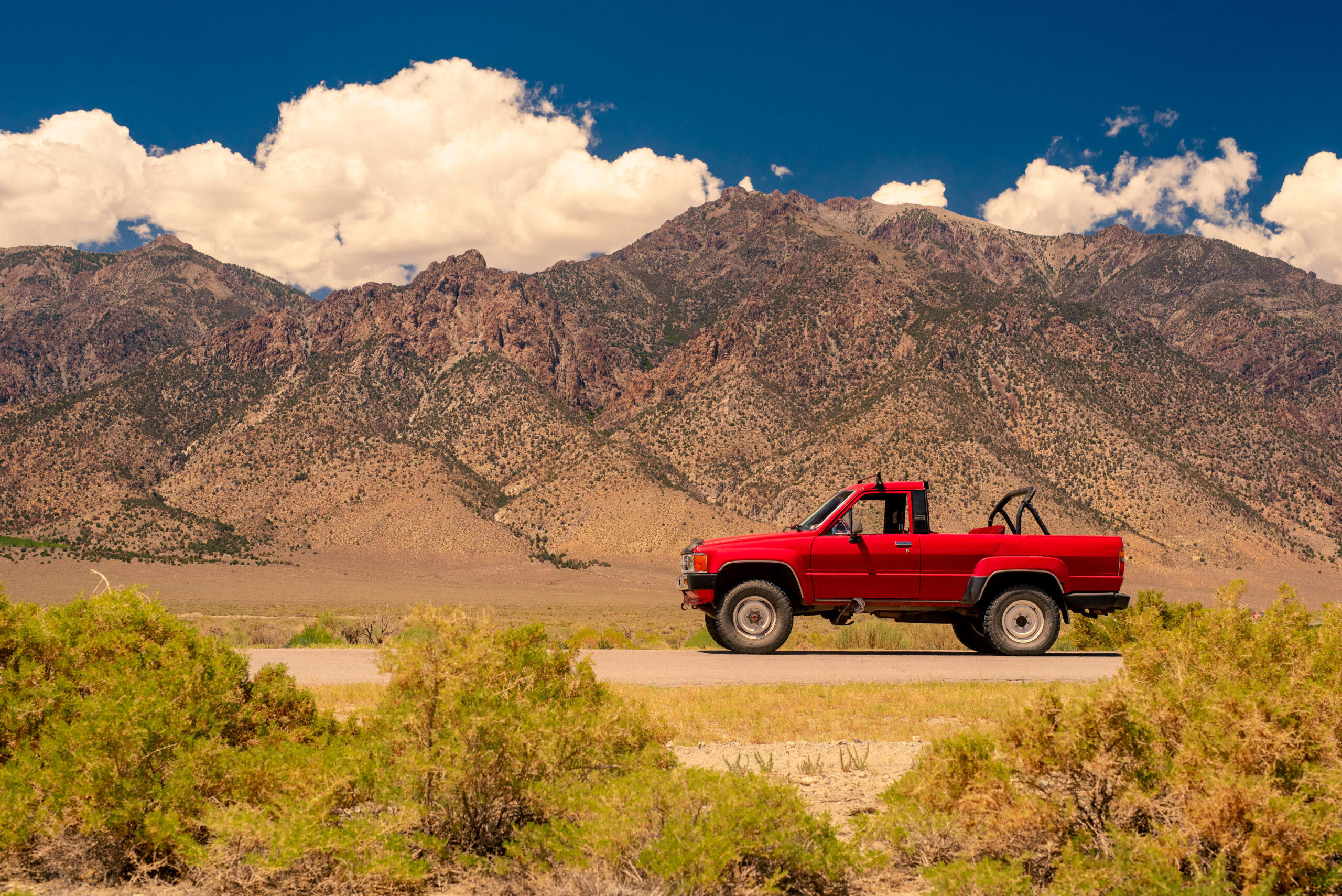
Instead, I want my picture to have most of its brightness in the middle section; that will give me the best base to edit from. To do this, I’ll up the exposure about .7 stops to compensate for the fact the original photo is a little underexposed. Then I’ll take the highlights and move them down to remove any “hot-spotting,” or points of overexposure, and raise the shadows to remove any lost detail in the dark areas of the photo.
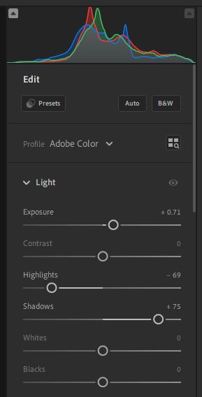
At this point, my histogram is centered and I have a clearer image, but you’ll notice it’s much more washed-out. That’s normal at this stage, and all of this initial setup will allow me to play with the settings that will add more contrast back in: Whites and Blacks. (I could add more contrast in with the Contrast slider, but generally, using the Contrast slider results in a more stylized image with intense colors, and I prefer to edit color intensity separately later for more fine-grain control.) I usually bump the Whites slider up by a small amount and the Blacks slider down by a significant amount, until my highlights are fairly close to the right side of the histogram, and my shadows have just started to peak on the left side of the histogram.
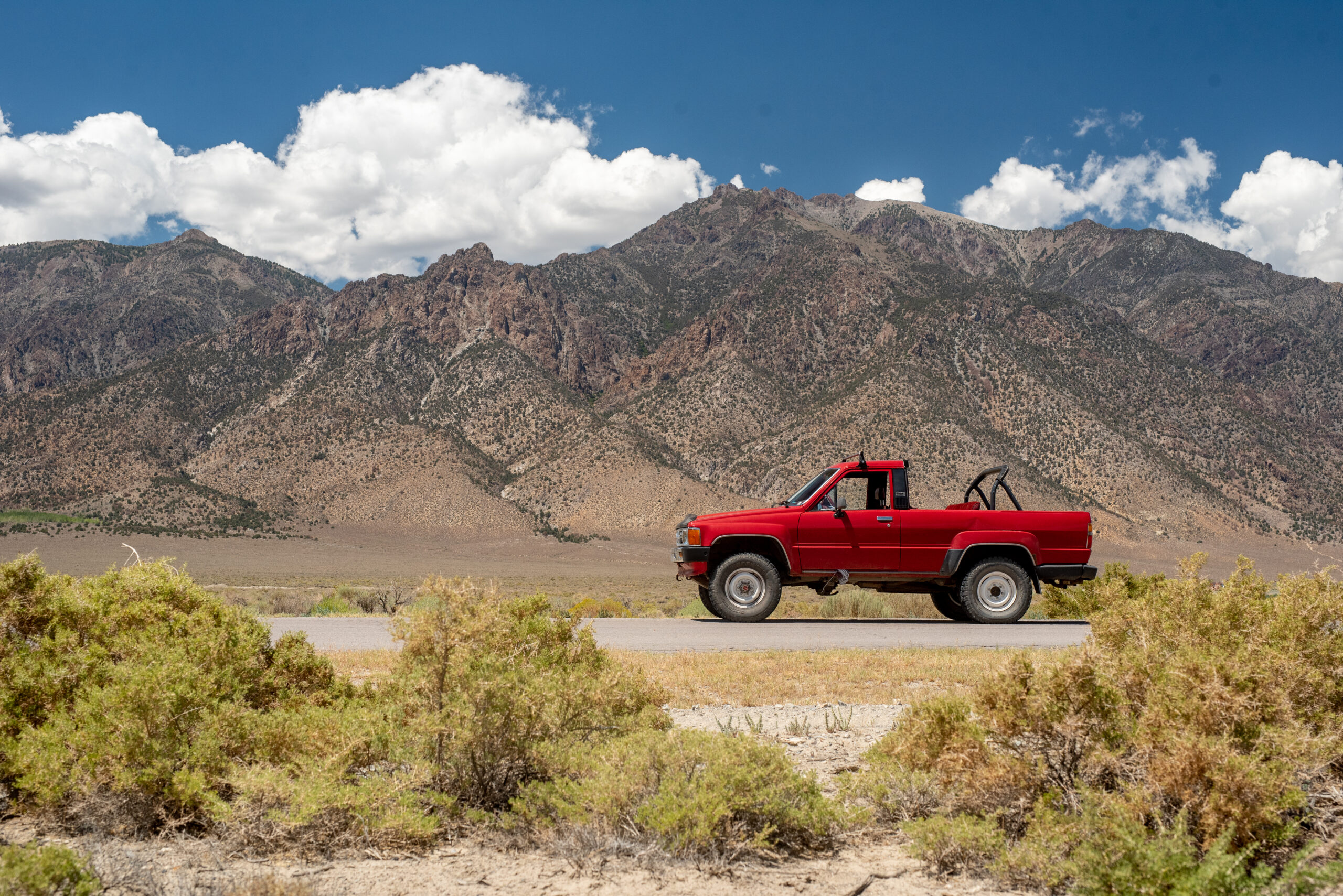
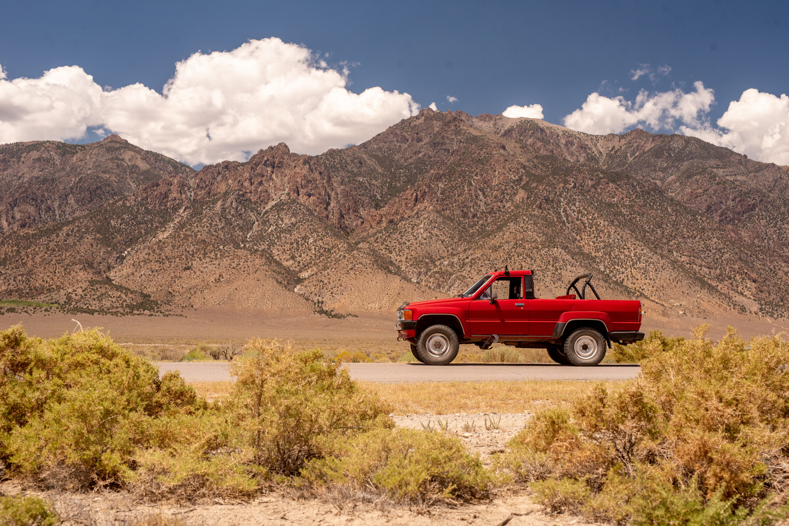
It looks like a decent photograph again! The truck pops nicely from the background, and at this stage, it looks more or less like what the scene looked like to my eyes in person, but we’re not finished yet.
Now that we have the basics done, we’re ready to move on to the next (and more fun) step: color.
2. Understanding Color


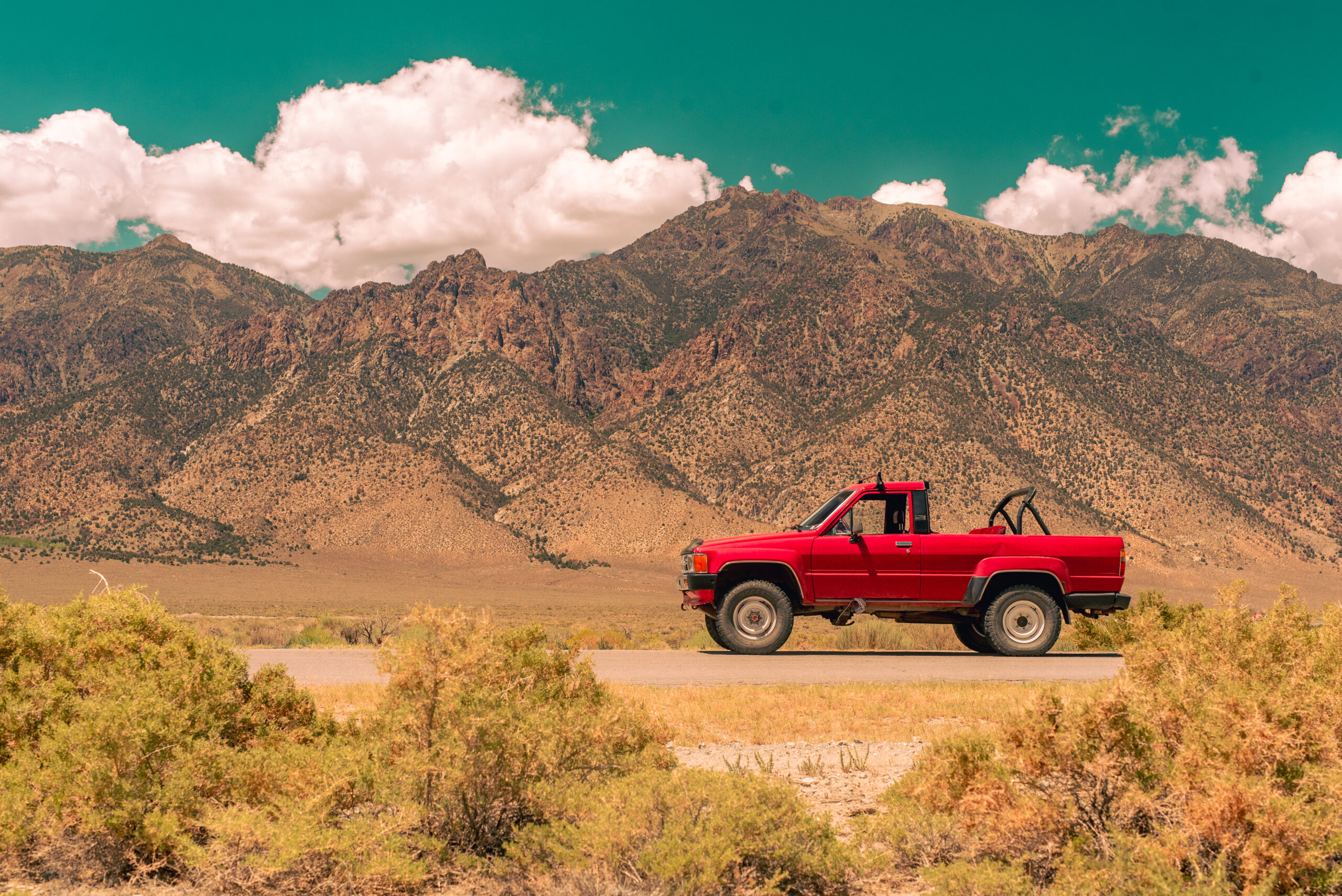
Color editing in all photo-editing software consists, at the bare minimum, of temperature and tint. These make up the “white balance” of the photo. Tint is a linear scale from green to magenta hue, and temperature is a linear scale from blue to yellow hue. By increasing the temperature to the yellow side of the scale, the photo is “warmer.” Do the opposite, and the photo is “cooler.” I’ve included two different edits of the same shot and their settings, but the warm one is the one I’ll be sticking with for my edits. I tend to use warmer color balances in broad daylight or sunsets, and I save cooler color balances for overcast skies or night shots.
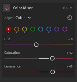
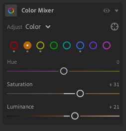
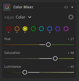
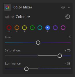
Now is when personal taste reigns and my tips become mere suggestions. We have reached the Color Mixer of Adobe Lightroom, which allows you to adjust hue, saturation, and luminance (brightness) for eight different colors in the photo, covering the entire rainbow of pixels that can appear in your image.
In this photograph, with a red truck and a deep blue sky, I’ve chosen to make the reds brighter and more vibrant, and the blues of the sky darker and more intense. I’ve also darkened the yellows and shifted their hue to be more green, so the foreground bushes don’t steal focus from the truck, and lightly boosted the oranges, so the mountain has more intensity in the photo.
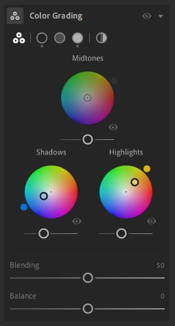
The final, and most advanced step, is to adjust your color grading (also referred to as split toning). This is the most complicated step, and it’s best to have a light hand with it, but it allows you to add an individual color tint to shadows, highlights, and midtones independently.
For this shot, I’ve chosen to do mild shadows and highlights on opposite ends of the color wheel (warm yellow highlights, and cool blue shadows), but any style is possible at this phase. Color grading is something I usually save for my most stylized photographs or ones that I intend to use as a series (such as in a photobook) where a consistent and recognizable style is needed, but it’s a powerful tool to have.
3. Understanding That You Can Do Literally Anything Now
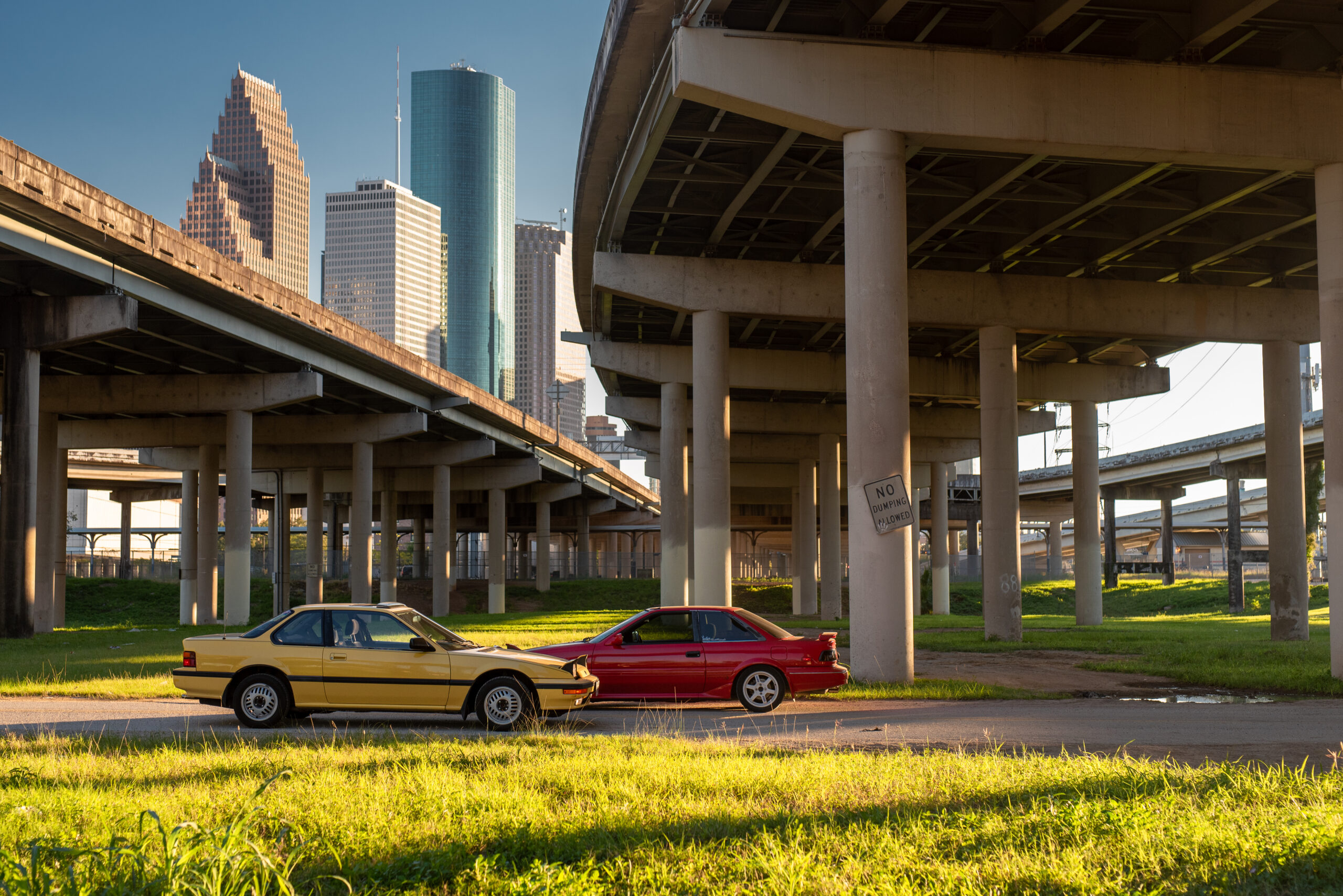
With your solid base established, you can basically do whatever you want with your edits. Colors are made up, and as a photographer, you decide what they are. You can go with a super-stylized ’70s film look, like the left; you can create a better-than-real “true color” image like we created today, in the center; alternatively, make your car the sole focal point, and remove all other traces of color, like on the right. All of these use the same light edits and rely purely on color edits to create a style.
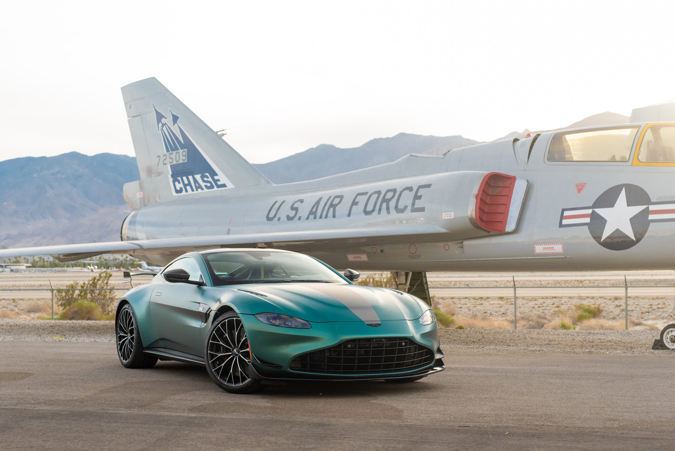
Shot #3: Aston Martin Vantage F1 Edition; Nikon D750 + Sigma 50mm f1.4 @ f5.0 for 1/800 second, ISO 1000. Victoria Scott
Even your light-editing technique will have to change slightly depending on the color of the car you’re using as your focal point. In the shot of my friend’s Prelude and Corolla, the underlying edit is quite dark; even though I’m losing some detail in the shadows of the bridges and I have a left-skewed histogram, the final shot still pops because the cars and the skyline are lit well.
In the shot of the Aston Martin, I did the opposite: I intentionally overexposed the hazy and uninteresting sky to make the plane and mountains the focal point of the backdrop, rather than the sky. My histogram is very right-skewed, but the final shot centers the exposure level of the car perfectly. These “exceptions” are fairly common, but what’s important is to know the basics and how to apply them, and the rest will follow naturally from there.
Good luck, and happy editing!
Got a tip or question for the author? You can reach her here: victoria.scott@thedrive.com.