I just spent a week test-driving the 2026 Hyundai Palisade XRT. It’s a great vehicle that does a lot of things well. But the interior, specifically the cockpit layout, is nothing less than a triumph of automotive design. I know, that’s high praise for a mass-market normie car. But I’m not kidding. Let’s get into why Hyundai has the perfect formula for family car dashboard design.
All car interiors need to balance looks, feel, and user-friendliness—the Palisade stands out because of how well it allows those three concepts to harmonize. The look of everything, from buttons to console shape, is soothingly resolved. The placement, design, and haptics of controls are thoughtful and satisfying. And even with its deep bench of digital features, I was able to understand how to use everything intuitively. The looks, feel, and user-friendliness of the Palisade all flow together in a way that’s superior to anything I’ve driven in recent memory.

There’s nothing revolutionary or stunningly opulent on display here. It’s not aggressively minimalist like a Tesla, amusingly novel like an Ineos Grenadier, or technomax chaotic like a new BMW. But it’s better than “it just works.” The Palisade interior feels like a greatest hits of everything you can get right about dashboard design, and equally important, it bridges the gap perfectly between modern-digital and familiar-physical.


The Look
Hyundai’s big on ovals and circles right now. Absolutely everything inside the Palisade has a round corner—this helps everything feel important and intentional. Even the set of buttons by the driver’s left knee, occasional-use stuff like the trunk release, has a deliberateness to it that’s often lacking, even in high-end cars.

The big shapes are similarly cohesive. The split center console looks like two ends of a plug that fit together. The meeting of the door and dash is harmonious, even though both the doors and dashboard feel like their own distinctive, self-contained design elements.
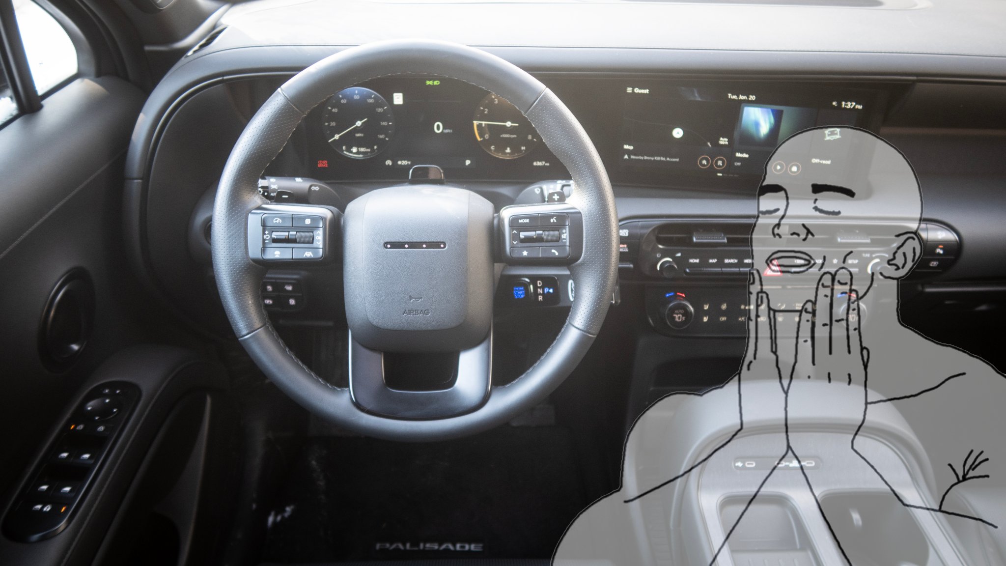
And critically, there’s the gauge cluster and infotainment screen. Both are large and legible without dominating the driver’s view; there’s no “glued-on iPad” look here at all. The center screen is handsomely integrated well below your road-facing sightline, and slightly canted toward the driver for exceptional readability.


Hyundai’s digital realm is both readable and nice-looking. There are several selectable display styles, all of which suit the whole car’s aesthetic while also being decidedly different from each other. The off-road display mode in particular hits a sweet blend of style and substance, neatly packaging nerdy displays (things like numerically expressed water temp, trans temp, pitch-and-roll) in a way that feels purposeful but still fun.
And finally, the resolution on parking cameras is awesome, making low-speed maneuvering quite easy.

The Feel
The Palisade XRT’s interior materials are fine, but they’re nothing special. The “feel” I’m praising here is the placement and haptics of the car’s physical controls, which are absolutely excellent.
Hyundai’s column shifter, which houses the engine start button (brilliant), is great—button on the end for park, twist one way for drive, twist backwards for reverse. Toggling reverse triggers a small vibration, another nice touch that helps the car communicate with you.


A good range of physical buttons and a small capacitive touchscreen, supplementing big temperature knobs, provide instant access to any function you would want in a single button-press or twist. The stereo volume knob is offset by a radio tuning knob (still great for ripping through radio stations, even in 2026) for symmetry.
I also like the parking brake control—look how there’s a little space carved out for easy one-finger operation. Even with my crippled left hand, I found this pleasingly user-friendly.
The Driver’s Experience
To further contextualize why I love the new Palisade’s cockpit so much, let’s talk about some contemporaries I hate. The current-gen high-trim Toyota Tacoma, man, sitting behind that dash feels like being at a Buffalo Wild Wings. You’re peering over a giant television just to see the hood, let alone the road. And switching between drive modes forces you to sit through a seven-second animation that consumes the entire gauge cluster. It’s ghastly.
Similarly overstimulating is the dash of the BMW M5 Touring. There are so many accent lines and digital design elements on the screen of that thing at any given time that it’s hard to parse what the hell you’re looking at. When you hit the hazard lights, everything from the dashboard to the dang doors blink red at you like you’re supposed to be bracing for impact from a fast-approaching missile. Just … why?
Meanwhile, the Palisade delivers everything a brand-new car should in terms of connectivity and on-road entertainment without assailing you with stimulus.


It looks good, it feels good, and the whole package is refreshingly fluid. I’ve become pretty cynical about modern automotive interiors, but the 2026 Palisade has given me some renewed optimism that humanity can design a control spread that marries present-day modernity with user-friendly familiarity.
We’ll get into a full vehicular review of the XRT, including off-road driving impressions in the near future. But as for the interior, it’s pretty much perfect.
Is there another 2026-model-year vehicle with a better cockpit? My inbox is always open at andrew.collins@thedrive.com.