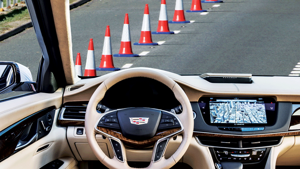
Somewhere on the highway between Oklahoma City and Santa Fe, a line of orange traffic barrels appears in front of me in a diagonal, nudging me into the adjacent lane to accommodate a construction crew. You know the barrels. They’re spectacularly obvious obstructions, with glittery white banding and animated LED arrows billboarding the fact that I shant be continuing in that lane. No big deal. Happens all the time.
The problem, though, is that I’m in a semi-autonomous car, a Cadillac CT6 equipped with the company’s impressive new highway-only Super Cruise system, and at the moment it’s driving the car. The little road display in the instrument panel indicates that there are no obstacles ahead of us—a clear path—and the car is blithely hurtling forward.
Technically, that’s what it’s supposed to do. The Super Cruise system is billed explicitly as a driver aid, meaning I’m the one in charge, and it’s on me to be vigilant for such things and take over the driving when necessary. Though its digital noodle can see the barrels, it’s not programmed—yet—to react to them. The reason is simple: there’s no uniformity or standardization to how and when the barrels and cones are used, so it would risk over- or under-reacting in any number of scenarios. The same ruling concept holds true for other roadway hazards. It’ll track other vehicles, but cones, flying mattresses, and rubber treads spun off of truck tires by design don’t exist to semi-autonomous cars.
I have no quarrel with that, either. All in good time. But what I do take issue with at this stage of our progress is that I usually have no idea what semi-autonomous cars see and don’t see, know and don’t know, and will and won’t react to. Not that they should necessarily throw up images of possible obstacles even though they’re not reacting to them, but while barreling toward those barrels, it would have been nice to have had a positive indication that it wasn’t about to react to something so that I knew I’d need to—particularly because a few hundred miles before, the car actually did shimmy over to avoid barrels in a nearly identical situation.
That’s a problem.
The only difference was that in first instance the construction folks had added decent enough lane markings when they dropped the cones in. When that doesn’t happen, the absence of an alert or reaction isn’t enough: I want prominent a visual indicator that the car thinks everything is fine. That might be an enormous, animated, green ALL SYSTEMS GO! arrow scrolling infinitely toward the horizon, indicating the car is driving and not about to react to something. Or it might be a huge, pulsating green steering wheel front-and-center in the instrument cluster.
When the cars do detect problems—and eventually react to them—those huge icons can shift to yellow, then red, etc., and show the encroachment graphically. Then I’ll know with even more clarity whether or not I’ll need to swoop into action.
This problem is true across the board. The semi-autonomous drive systems from Tesla, Audi, Mercedes, Lexus, Volvo, Cadillac, and others all meter out information to the driver in frustratingly primitive, inconsistent, and mostly unhelpful manners. Granted, the challenge for automakers is huge. “It’s a problem in academic circles we refer to as ‘theory of mind,’ in which we want to be able to build a picture or model of what you think your interacting party—in this case, the computer—knows and is doing,” says Melissa Cefkin, an anthropologist who studies human-machine interfaces at the Nissan Research Center in Silicon Valley. “That’s the challenge with any artificial intelligence system. What does it know, what does it think it knows, and what is it responding to—and what part of that should it actually express to the user? There’s lots of experimentation going on with different kinds of representations, and determining which of those ways of surfacing that data is useful without crowding the real estate with too many bells and whistles.”
Unfortunately, it’s not just knowing what the system knows that’s proving to be so challenging. Even engaging the semi-autonomous drive tech in the first place has so far proven to be similarly befuddling. In some systems, there are little steering wheel icons in the instrument cluster that blink and flash or change color when the system is available or actively engaged—but it’s usually mixed in with other lights and icons in far-flung corners of the instrument panel or the steering wheel. When it is engaged, it’s great that a little car flashes when there’s a vehicle ahead of me, but what about when there’s one merging into my lane? I’m happy to act, but if the car is supposed to modulate distances to other vehicles, why wouldn’t it be able to react to these interlopers, too?
A key contributing factor to this confusion is the fact that the systems so far haven’t been holistic, clean-sheet designs, baked into the cars from the get-go. “Right now, these features are treated as ‘just’ features, and allocated a limited amount of space on the instrument panel, and also accorded limited testing,” says Wendy Ju, an executive director at the Center for Design Research at Stanford University. “Automotive manufacturers these days assembly subsystems from numerous different suppliers, so it would be surprising if everything performed as a seamless integrated whole within one or two generations of any feature. I don’t have a magic bullet answer for what it should look like, but I do feel that greater attention to the interface design and testing, performed earlier in the design process, is key to making major improvements.”
That needs to happen sooner rather than later. The fact is, I know how to use the systems and I know when and how to react when the car doesn’t. But I’m a card-carrying early adopter, tech geek, and bought-in advocate of advanced technology. But autonomy—with its multitude of benefits ranging from mobility to safety to efficiency to pure convenience—is not going to succeed and thrive in this treacherous in-between period until the cars start communicating better with those of us who aren’t already enthusiastic embracers of complex new tech.

I’m speaking about people like my wife, a brilliant woman who would love a system like Super Cruise but who’s interests simply aren’t oriented toward memorizing user manuals or conforming herself to the fickle demands of nascent systems. I’m also talking about my roster of buddies who dig all the press cars that come through my driveway but are completely unaware of the potential for autonomy. I want to be able to toss them the keys and tell them to try out the self-driving capabilities on the highway—without a 15-minute lecture first. “When you get on the highway, just hit this big white button and the car will start driving itself,” I want to say.
Current systems can be that easy, if their interfaces were intuitive enough. But most people are easily deterred by complex, nonintuitive technology. They only way to get them onboard with autonomy is simplicity. The Big Green Arrow I mentioned above, for instance. For $5,000 Super Cruise packages to actually pave the way for greater autonomy, the industry needs a better system than icons on already cluttered instrument panels. Cefkin readily boils it down to a few guiding lights of what not to do vis-à-vis human/machine interfaces. One prominent failure: Photocopiers, which historically have been among the most infuriatingly inscrutable devices to use. Another office favorite is the coffee machine. “These things speak to the problem well,” she says. “Coffee machines these days are prone to conveying the same information in multiple forms. We just want to know if it’s still brewing or is done brewing, but it cycles through three different interfaces all telling you the same thing, with lights, tones, bars, screens, and more. Can I take my coffee or not?!?”
There are plenty of places to glean inspiration for improving interfaces today. Aviation, for instance—an industry that has made the streamlining and prioritization of information the keystone of cockpit safety. The systems are still for expert users—individuals trained to manage a lot of information—but I can now climb into the cockpit of certain advanced business jets and pretty quickly grasp what’s going on.
Contrast this with the increasingly complex automotive displays, with dynamic digital graphics that seem to favor wavy lines and data-heavy streams of dubiously useful intel. Sorry, but I haven’t gleaned anything useful from a boost gauge in 20 years. Ditto the engine temp. Tell me when it’s a problem; otherwise, get out of my face. Sadly, current driver interfaces are often as confusing and disorienting as they are impressive and entertaining, as though the marketing department was pushing something that should absolutely be the sole purview of safety and usability pros, given the unusual nature of this new tech.
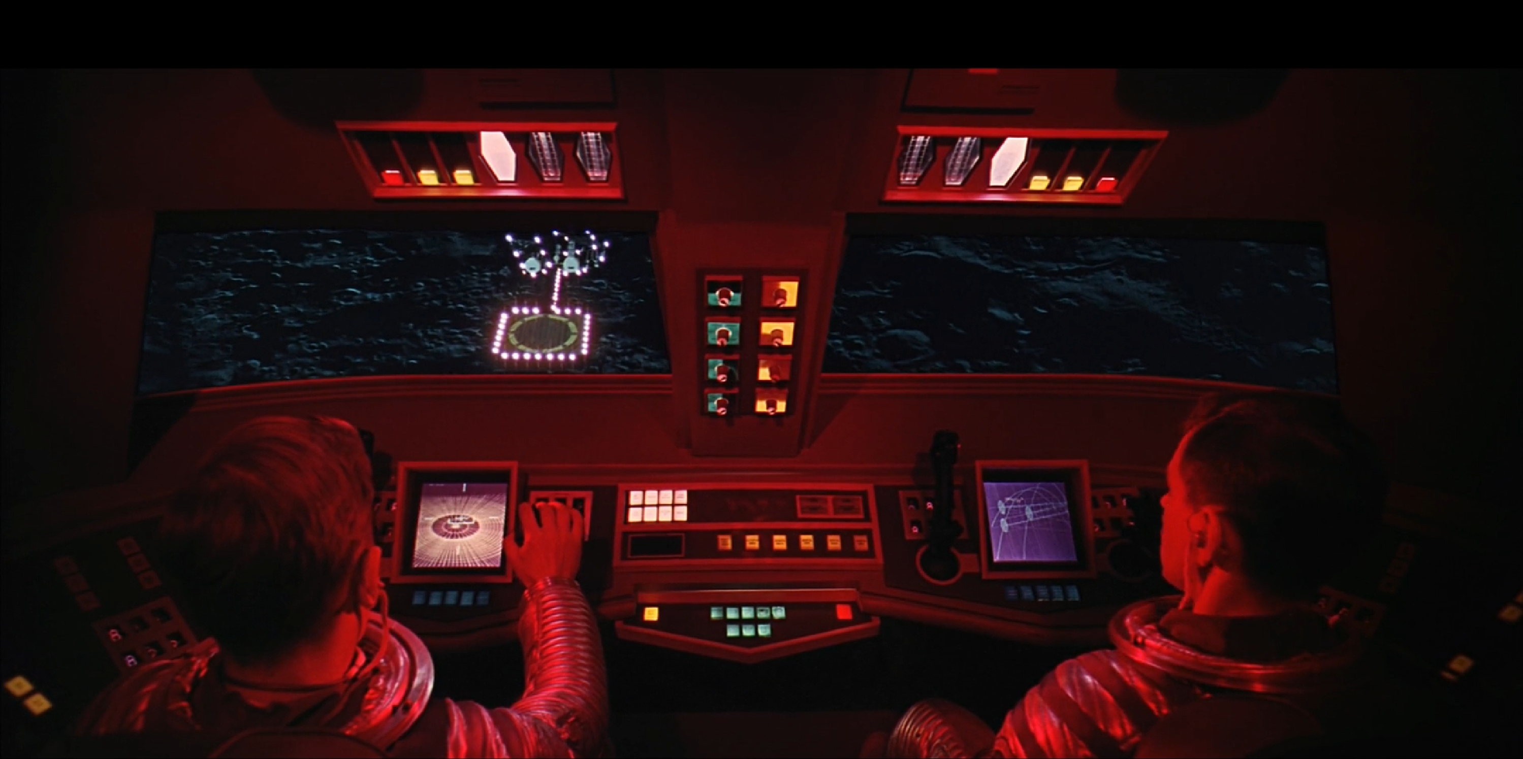
But my own gold-standard reference has actually become—in all seriousness—Stanley Kubrick. Go watch 2001: A Space Odyssey from 1968 and look at the control panels of the separate spacecraft used to reach orbit, fly to the Moon, translate across the lunar surface, and, later in the film, operate the extravehicular activity pods. Those aren’t the whimsical riffs of a 60s set designer; they’re thought-out projections of what human-machine interfaces would be like in a more advanced technological society, envisioned by Kubrick and Arthur C. Clarke, who co-wrote the screenplay. Some are more complicated than others, but the gist is the same: The system does the thinking and tells the operator what he or she needs to know. Take that left-hand screen (below) with the automatic landing guides and replace it with a big green arrow, and it could be the next semi-autonomous Cadillac.
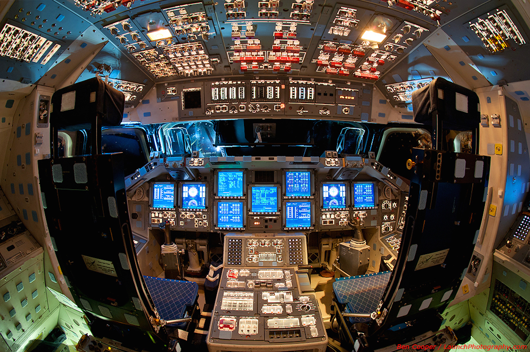
I’m guessing, by the way, that it’s likely that when Elon Musk and Jeff Bezos unveil the control panels for their own spacecraft at SpaceX and Blue Origin, respectively, they’ll look more like a Kubrick creation than, say, the overwhelmingly complex Space Shuttle of yore—simple, clean, with necessary data, sure, but not incomprehensible boatloads of it.
Fortunately, there is hope. Tesla, perhaps not surprisingly given its penchant for clean-sheet envisioning of automotive systems, does in fact lead the way in terms of intuitive interfaces in its Autopilot systems. The new Lexus LS has a crazy-good head-up display that is nothing less than 24 inches wide, including a dynamic representation of the road ahead when the automatic cruise control is enabled.
Similarly, Cadillac’s curved LED bar on the steering wheel is a good binary cue as to the system’s status—though it can’t save the confusion in the instrument cluster. Once augmented reality really sinks its teeth into the industry in the next few years, it will begin projecting directional cues and alerts onto the road ahead—visually instead of through cryptic tones and icons. Acura’s recently unveiled Precision Cockpit, meanwhile, is perhaps the most promising solution so far, a system that is engineered explicitly to enhance driver awareness while minimizing distraction and confusion. That sort of thinking is absolutely the future of driving—both near-term and long.
Eric Adams is The Drive‘s Technology Correspondent. Follow him on Twitter at @ericadams321