
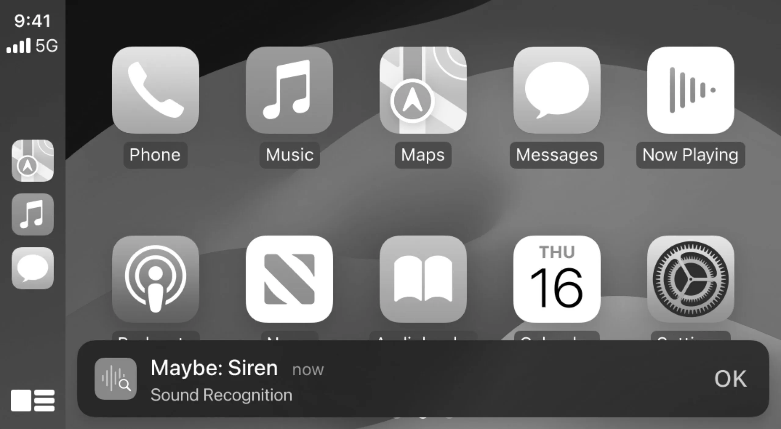
Apple is introducing some small but meaningful changes to both iOS and CarPlay that are reportedly all about accessibility. A new feature called “Vehicle Motion Cues” will help people who suffer from motion sickness, as well as adding “Sound Recognition” to help deaf or hard of hearing users notice car horns and sirens that they would otherwise be unable to hear. The Cupertino company says these changes are supposed to enable people with disabilities to better interact with their iPhones and iPads, as well as the ubiquitous Apple CarPlay interface.
Vehicle Motion Cues seems like a neat little trick that the iPhone has learned, leveraging its myriad sensors (like GPS and accelerometers) to determine when an iPhone user is sitting in the passenger seat of a car. The motion of the vehicle can often bring about the onset of motion sickness, which has symptoms that range from cold sweat, to nausea and vomiting, to headaches and drowsiness, among others. Motion sickness can be caused “when there is a mismatch between actual versus expected sensory inputs,” according to the NIH. Fun fact: nausea, a common symptom of motion sickness comes from the greek word for ship, naus.
The NIH recommends that people who suffer from motion sickness refrain from reading, say, an iPhone or iPad screen in a moving car, since the motion of the ambient surroundings is zooming past while the contents they’re looking at in front of them are more or less fixed in place. In order to reduce the ill effects of motion sickness, the Apple device’s screen will show animated dots that correspond to changes in vehicle motion. As the car moves forward, slows, turns left and right, the dots will follow this movement and add a bit of “movement” inside of the fixed screen. It’s a neat solution for passengers though not for drivers—likely because drivers are not supposed to be using their phones in the first place. But the massive tablet on the dashboard is fair game. Hmm…

In any case, Apple has been doing things along this vein for the last four decades, according to CEO Tim Cook. Apple has long developed and optimized settings for people with disabilities, and some of these are useful for many folks in general. Case in point: if you feel like modern smartphones have become a black hole sucking in your attention then you can always try applying a black and white (grayscale) filter to your screen by pairing “Color Filters” with the “Smart Invert” or “Classic Invert” features, found in iOS via Accessibility settings under Display & Text Size. This makes your screen much less visually appealing. Toggle “Increase Contrast” for an added boost in visibility.
It’s certainly not for everyone, but it’s a decent stopgap for those not keen on replacing their iPhone with a full-on dumbphone, which is totally making a comeback for smartphone-weary Millennials and Zoomers, as the New Yorker reports.
Something akin to this might soon be available for CarPlay itself, with Apple saying, “For users who are colorblind, Color Filters make the CarPlay interface visually easier to use, with additional visual accessibility features including Bold Text and Large Text.” I’m no fan of CarPlay. My daily lacks the feature anyway, being such an old shitbox that relies instead on an amber dot-matrix display built into the Blaupunkt single-din head unit. If I had to use CarPlay in my daily, I’d be inclined to use the Color Filters to tone down the loudness of colors on-screen to make them less distracting.

Got a tip? Email us at tips@thedrive.com