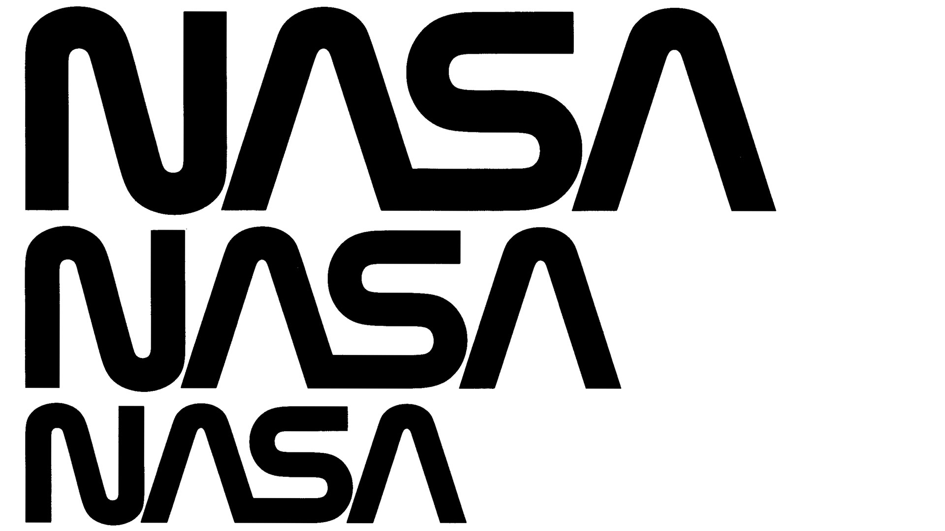
Ask the marketing team behind “New Coke” and they’ll tell you that many people don’t like change. So in 1992, when NASA traded its classic, modernist “worm”-style logo for today’s overweight, overwrought “meatball,” space and design nerds were upset in kind. Luckily for the horn-rimmed spectacles, pocket-protector, and jet-fuel-sipping sets, one Kickstarter campaign is reissuing NASA’s old style and standards manual: essentially, a handbook and guide that outlined the look of every NASA product, from rocket graphics to office stationary. All the old logos, stripes and graphics will be represented in perfect detail, as the reissue will be sourced from a scanned, pristine copy of the book. (We hope no one considers it sacrilege to rip out the pages and paste them on our wall, because it’s going to happen.)

Though the manual was originally a floppy thing, the new version will be hardcover and will include a 35mm slideshow of NASA’s design highlights circa 1974, which designers Danne & Blackburn used to pitch the agency on the manual back in the day. As you would expect from a project helmed by two graphic designers, all of the paper and printing techniques that make-up the tome are top notch and, befitting a NASA-approved project, each book comes wrapped in a “static shielding pouch” that heavily resembles mylar. Pre-orders ship May 3rd, and copies will be available at Strand Bookstore in New York, as well as Breakfast in Santa Barbara. We’d pick up a copy, dust of a Steffi Graf poster, flip on Mariah Carey’s “Emotions,” and stew in the glories of 1991, before the “meatball” and all the other tragedies of the Nineties rained down. NASA nostalgia is one of the better kinds.