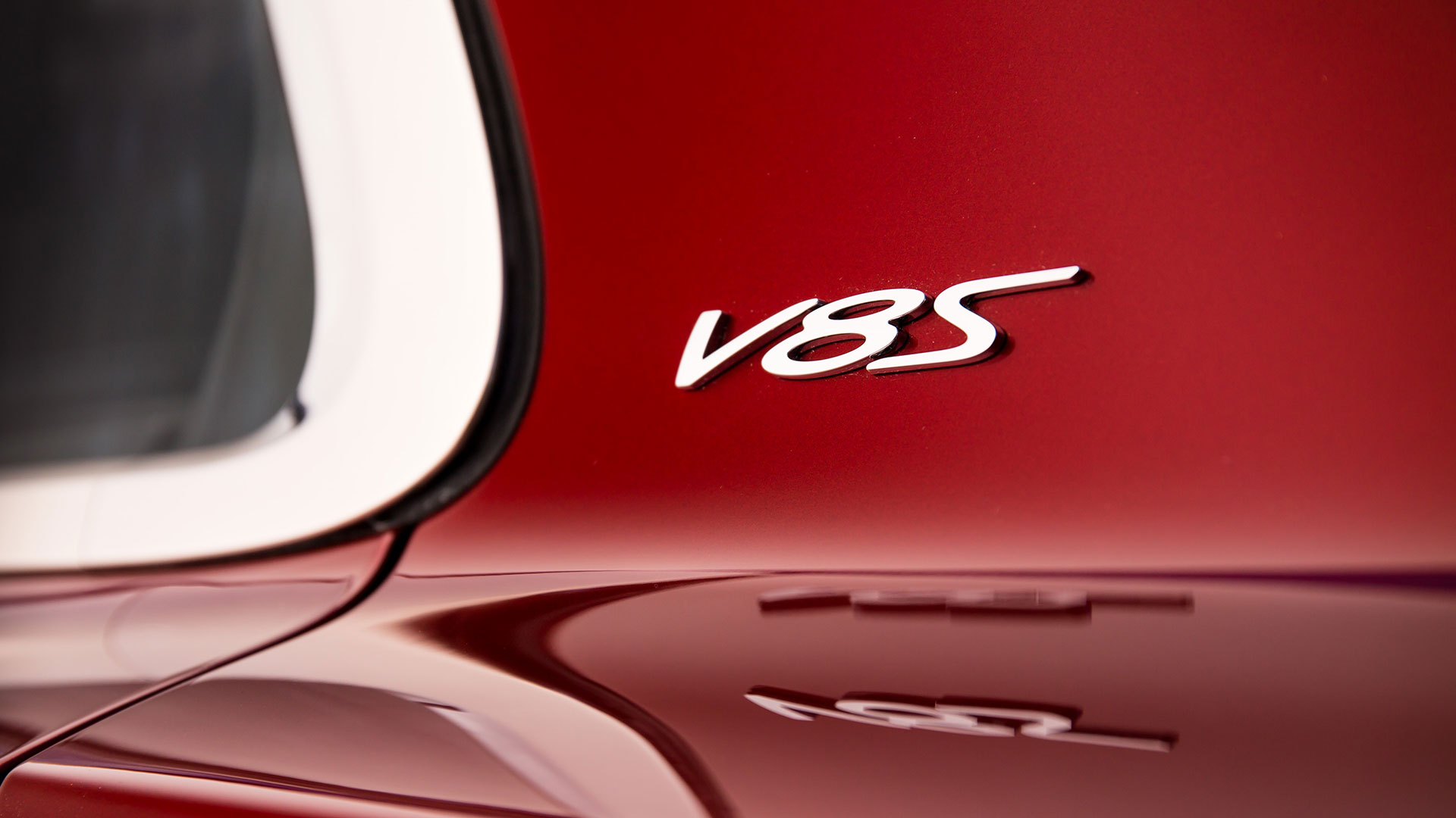

It seems harmless enough: a chrome “V8S” badge affixed to the C-pillar of the newly unveiled Bentley Flying Spur V8 S. The 521-horsepower super sedan, making its public debut in March at the Geneva Motor Show, will slot between the quick, 500-horse Flying Spur V8 and the profligately quick, 616-hp Flying Spur W12, and carries a 0-62 mph estimate of 4.9 seconds. Clearly, Bentley sweated the small stuff under the hood. How, then, could the designers of this 2.4-ton Barcalounger, fitted with all the exotic veneers and fragrant hides befitting the Bentley badge, get one detail so wrong?
Steven Heller is one of America’s foremost authorities on typography and graphic design, and has this to say of the V8S badge: “It’s something I’d expect on a Grand Prix.” The Drive just checked, and the defunct General Motors division responsible for the Fiero is not among Bentley’s competitors.
As co-founder of the School of Visual Art’s graduate design program and author of more than 160 books about political art, graphic design and illustration, Heller is a design ninja, with a deep and abiding grasp on how logos and typefaces may or may not complement the products they’re glued to. Professor Heller regards the Flying Spur’s “V8S” badge, which also appears on the Continental GT V8 S, not with scorn or disgust, but with confusion.

“Looking at those characters, it just doesn’t ring Bentley,” he says. “Unless they’re trying to change the brand identity so that it appears more accessible, it seems off.” Granted, Bentleys are no longer the sole preserve of tweedy chaps who fancy a spot of locomotive racing. Paris Hilton, Floyd “Money” Mayweather and Soulja Boy are among the luminous lights pushing their Bs to the Coffee Bean & Tea Leaf for Malibu Dream Ice Blendeds. It’s a new century for the Bentley Boys, who believe their marque can stretch to accommodate new, heretofore heretical ideas about itself. (See: Bentayga.)
“It could be that this new Bentley is trying to do what the new Jaguar is doing: altering the perception that it’s an elitist vehicle,” Heller says. “Maybe they’re trying to make the brand appear more accessible. This car may be very expensive, but the logo seems to democratize it.”
Read: It makes the Spur look cheap.

Some typefaces, like that of the Chevrolet Bel-Air of the Fifties, become signposts of an era; to discuss any car of that decade is to recall the Chevy’s florid script, rendered in brilliant chrome. These typefaces are of a piece with their time, and with the products that wore them.
Other typefaces lead more rootless, itinerant existences, cropping up everywhere from Mattel toys to soda cans. When asked, Heller agrees that the script used for the “V8S” is mighty close to what you’d find on late-model Porsche 911s, particularly the 4S models.

“And it’s really not suitable for Porsche, either,” he says. “Why don’t these companies come up with something different?”
Unless you’re Lexus chief Tokuo Fukuichi, who oversees all styling at Toyota, carmaker CEOs are not likely to sweat typography much. Neither might a consumer—even a Bentley buyer with $225,000 to burn. And with ultra-luxury brands pummeling sales projections every quarter, who cares if some subway-riding design prof in New York objects to a badge on one of their vehicles?
Certainly not Heller. “I’ve never been all that good at business,” he concedes.
